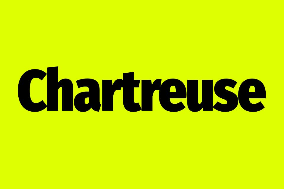
Have you ever come across a color that just screams “Look at me!”? Well, that’s the striking chartreuse color, my friend! Found somewhere between green and yellow it is a color that radiates energy and vibrancy that is hard to ignore.
In this article, we are going to look at how Chartreuse is created, what it looks like, and what colors it works well with. I’ll also throw in some hex color codes and swatches so that you can begin using them on your website or in your designs right away!
Let’s get started!
What Color Is Chartreuse?
Chartreuse is a bright and bold blend of green and yellow – think limes, tennis balls, and safety gear!
It gets its name from a herbal liqueur that was distilled in a French monastery found in the Chartreuse Mountains.
This liqueur, which you can still buy today, is known as “Elixir Vegetal de la Grande Chartreuse“. It has a very distinctive greenish-yellow color which eventually led to the chartreuse color also being named “chartreuse”.
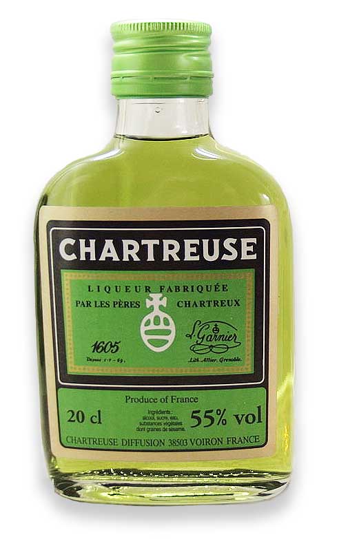
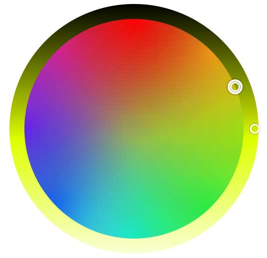
Source: JIP, CC BY-SA 3.0, via Wikimedia Commons
What Does Chartreuse Look Like?
Chartreuse almost looks like a neon yellow color to me, similar to the bright yellow fluorescent highlighters we used at school! This chartreuse color is also known as chartreuse yellow and it is the more traditional variation of the color.
This is what chartreuse looks like:
Chartreuse / Chartreuse Yellow
Hex Code: #DFFF00
RGB Value: RGB(223,255,0)
There is however another color known as chartreuse green that many people will also simply call “chartreuse”.
This is what chartreuse green looks like:
Chartreuse Green
Hex Code: #7FFF00
RGB Value: RGB(127,255,0)
What Colors Create Chartreuse?
To create the chartreuse color, you would combine the primary colors yellow and green. Depending on the proportions used, you can create a whole spectrum of colors ranging from vibrant chartreuse yellows to equally vibrant chartreuse green colors.
In art, you would start with yellow and slowly add small amounts of green mixing until you reach the shade you would like. Using more yellow will create a warmer, more yellow color while using more green will create a cooler green color.
If you want to mix chartreuse green then you would start with green as the base color and slowly add yellow to it until you reach the color you would like.
Is Chartreuse A Tertiary Color?
Yes, chartreuse is considered to be a tertiary color. Tertiary colors are created when you mix a primary color with a secondary color. For chartreuse, we mix the primary color yellow with the secondary color green.
Where Is Chartreuse Found On The Color Wheel?
On the color wheel, chartreuse is found between yellow and green.
Chartreuse RGB Color Code
RGB color codes are displayed in the following format RGB(RR,GG,BB) representing the amount of red, green, and blue in each color. From the RGB value below, you can see that chartreuse does not contain any blue in its color code.
Chartreuse RGB color code: RGB(223,255,0).
Chartreuse Hex Code
Hex codes are displayed in the following format #RRGGBB, again specifying how much red, green, and blue are found within a specific color.
The chartreuse hex color code is #DFFF00.
PIN FOR LATER!

Is Chartreuse More Yellow Or Green?
Chartreuse is a really interesting color that is quite hard to define. Some people say that it leans towards yellow while others think it looks like it is more like a green color. In reality, it’s a blend of both shades with characteristics of both.
To compare, this is what yellow and green look like alongside chartreuse:
Yellow
#FFFF00
RGB(255, 255,0)
Chartreuse
#DFFF00
RGB(223,255,0)
Green
#00FF00
RGB (0, 255,0)
What do you think, does chartreuse look more yellow or green?
Chartreuse VS Lime Green
There is quite a distinct difference between chartreuse and lime green! The chartreuse color is a lot more bright and vibrant and it has a very distinct yellow color to it. In fact, against lime green, it looks a lot more yellow than green.
Lime green on the other hand is a lot more of a subdued color that is less bright and intense with no apparent yellow undertones.
If you compare lime green with chartreuse green you will see there is also quite a distinct color difference with lime green still being a lot more muted and less vibrant than chartreuse green.
Chartreuse
#DFFF00
RGB(223,255,0)
Lime Green
#32CD32
RGB (50, 205,50)
Chartreuse Green
#7FFF00
RGB(127,255,0)
Is Chartreuse A Warm Or A Cool Color?
Traditional chartreuse is seen as more of a warm color with its bright, vibrant shade. Chartreuse green on the other hand is more of a cooler color as it tends to be more of a green color than a yellow color.
Chartreuse Color Shades, Tints & Tones
By experimenting with chartreuse’s different shades, tints, and tones you can create different nuances and variations of this incredibly vibrant base color!
How To Create Shades Of Chartreuse
Shades of chartreuse refer to deeper and darker versions of the color. By adding black to the base color, different shades are created which result in richer deeper colors.
Shades Of Chartreuse
Here are a few examples of different shades of chartreuse:
| #DFFF00 | #CAE415 | #ADC02C | #89943C | #62673D |
How To Create Chartreuse Color Tints
Chartreuse tints are created by adding white to the base color. This creates softer and lighter variations of the color that have a delicate quality to them the lighter you go.
Tints Of Chartreuse
Here are a few color swatches and hex colors for different tint colors.
| #DFFF00 | #E7FD4E | #EEFE81 | #F6FFB9 | #F9FED5 |
How To Create Chartreuse Tones
Tones of chartreuse are those colors that are created when chartreuse is mixed with gray. The colors created are more muted and subdued than the original base colors.
Chartreuse Tones
| #DFFF00 | #CCE043 | #AEBA5B | #A0A671 | #8E9175 |
Popular Chartreuse Colors
There are many different variations of the chartreuse color so you really are spoilt for choice! Here are a few of the more popular colors… and don’t forget to check out our green and yellow color palette collection if you would like to see a few color palettes that use chartreuse.
Chartreuse Green
#7FFF00
Yellow-Green
#9ACD32
Green-Yellow
#ADFF2F
Vintage Chartreuse
#9BA434
Spring Bud
#A7FC00
Pear
#D1E231
Watermelon Yellow
#EEFF1B
Lime
#C0FF00
Lemon-Lime
#E3FF00
Bitter Lime
#BFFF00
Dark Yellow Green
#728F02
Peridot
#E6E200
What Colors Go Well With Chartreuse?
Depending on the mood that you are going for you can use chartreuse with many different colors including cooler colors such as blues, grays, purples, blacks, and whites. You can also try combining it with warmer colors such as pinks and oranges.
Just be careful that you don’t use too much as it can become overwhelming!
However, if you are looking for an accent color, it works incredibly well at drawing attention to a specific element in your design or on your website.
Chartreuse Complementary Colors
If you are looking for a strongly contrasted color combination then complementary colors are a great choice! For chartreuse, its complementary color is a bright vibrant blue color.
However, if you want to tone it down a bit and create more of a classic look, consider using navy blue instead!
#DFFF00
#2000FF
Monochromatic Chartreuse Color Combinations
If you are looking for a more subtle and harmonious color combination then check out this monochromatic color palette (monochromatic colors are shades and tints of the base color).
#DFFF00
#CDE62E
#BCCC52
Some of these monochromatic colors are very similar to olive green. We also have an olive green color palette collection so be sure to check those out as well!
Analogous Chartreuse Color Combinations
Analogous colors are those that are found next to each other on the color wheel. In this case, your base color is combined with a very bright green and orange color.
#DFFF00
#60FF00
#FFA000
Triadic Chartreuse Color Combinations
Triadic colors are three colors that are spaced out evenly around the color wheel. Just like our previous color palette, this one is also very bright and dynamic with its bright neon blue and hot pink colors!
#DFFF00
#00DFFF
#FF00DF
Chartreuse Tetradic Color Combinations
Unlike our previous color combinations, tetradic color palettes use four colors. These palettes are made up of two sets of complementary colors that are combined to create a striking color palette where the colors contrast strongly against each other!
In this case, the complementary blue color from the complementary color palette is combined with another hot pink shade and a lime color.
#DFFF00
#2200FF
#FF00DD
#00FF22
While some of these color combinations are incredibly bright and bold, you can tone them down by using darker shades and tones of each color.
Chartreuse Color Meaning
While it’s important to remember that color meanings can vary when it comes to cultural and personal interpretations, there are a number of common interpretations and symbolic meanings that are attributed to the chartreuse color. •
Here are a few of the more common chartreuse color meanings:
- Vitality – Chartreuse is often seen as a color that represents vitality, freshness, and new beginnings and it often symbolizes growth and renewal.
- Inspiration – Chartreuse is seen as energizing, inspiring and encouraging.
- Optimism – Being bright and vibrant, chartreuse is often associated with feelings of positivity and a sense of joy. It tends to be an uplifting and happy color.
- Creativity – Chartreuse is a unique color that is often associated with self-expression and creativity. It is bold and it encourages unconventional thinking and originality.
- Balance – Because chartreuse sits between green and yellow it blends the qualities of both colors which include growth, warmth, and energy.
- Spirituality – Because the color green represents the heart chakra which symbolizes love, healing, and compassion, chartreuse is also linked to spirituality and mediation.
Conclusion
The vibrant chartreuse color is truly captivating and eye-catching so it is a great choice if you are wanting to choose an accent color that can’t be missed!