
55+ Happy Shades Of Yellow
Yellow is a bright warm color that makes us feel happy, optimistic, and positive! There are hundreds of shades of yellow that you can see in nature every day – from flowers to fruits to sunsets, you really can’t deny…
Are you a color lover looking for some fresh ideas to brighten up your journaling practice? Look no further! Our color ideas category is full of inspiration to help you add a pop of color to your journal pages. From colorful pens and markers to beautiful paper and stickers, we’ve got plenty of ideas to get your creative juices flowing. So why not take a look around and see what catches your eye? Your journal (and your inner artist) will thank you!
Yellow is a bright warm color that makes us feel happy, optimistic, and positive! There are hundreds of shades of yellow that you can see in nature every day – from flowers to fruits to sunsets, you really can’t deny…
When choosing a color palette it is important to choose colors that resonate with you and you simply can’t go wrong with different shades of green if you want to convey a sense of nature, growth, renewal, and vitality in…
Nobody can deny that red is one of the boldest, brightest colors out there! For centuries red has been linked to fiery emotions such as love and passion and even anger and aggression. Red is used to grab attention and…
Blue is one of the world’s favorite colors, and it isn’t hard to see why. There are so many different shades of blue to choose from, ranging all the way from delicate blues such as baby blue and powder blue…
Over the last couple of weeks, I’ve been creating a lot of color palettes that I hope will help you choose the perfect color palette for your designs! As it turns out, there are now a whole lot more color…
I love color! I find it fascinating how colors and emotions and interlinked and how they can impact our emotions, moods, and behaviors – often subconsciously. For example, did you know that red is often used in fast-food restaurant branding…
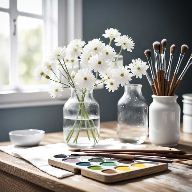
Color Ideas COLOR YOUR WORLD WITH MEANING Color is a powerful tool for expressing emotions and bringing depth to your journaling. From bright hues to muted tones, explore how color can help you convey your thoughts and feelings. Color &…
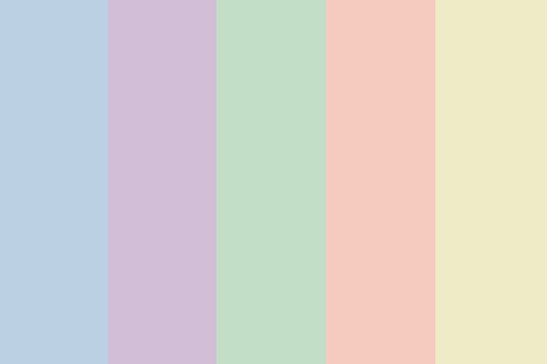
Pastel color palettes have been a favorite for quite a while now and it’s easy to see why! Their delicate muted tones are perfect for creating designs that are soft and calming and they have a unique charm that certainly…
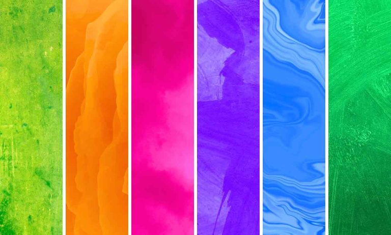
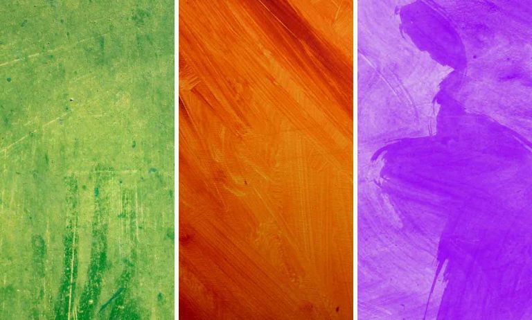
When it comes to color, there are the basics: primary colors and secondary colors. Both of these play a fundamental role in color theory and how colors are created. But things would be really boring if we stopped there right?…
Secondary colors are an essential part of color theory and the color spectrum! In my previous article about primary colors, we briefly touched on how to create secondary colors using primary colors. In this article, we are going to take…
Lavender is a beautiful pale shade of purple or violet that has become increasingly popular in recent years and it is a favorite color choice for many designers. But lavender isn’t just a gorgeous color, it also is a calming,…
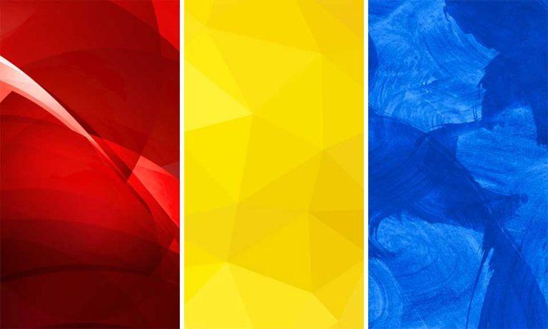
Primary colors are the foundation of all other colors! Or put another way, they are like building blocks on which all other colors that we see and use are created. Without the primary colors, we wouldn’t be able to create…
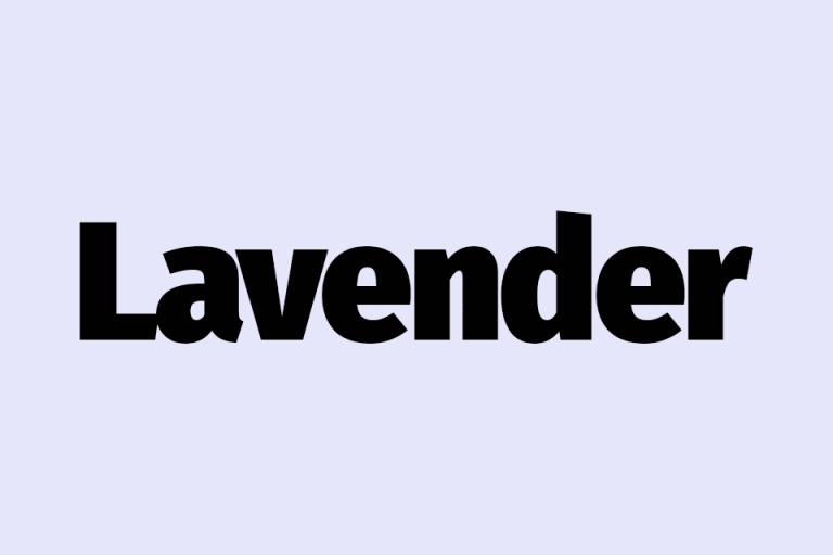
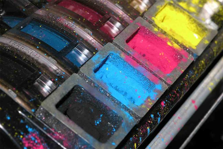
Colors are such an important part of our lives! This is especially true if you are an artist, graphic designer, or in any type of business, printing, advertising, or marketing field. Colors aren’t just visually pleasing but they also have…
Today we are going to talk about a beautiful color that sits somewhere between blue and violet on the color wheel, the one and only color INDIGO! But what color is indigo exactly? Is it a shade of blue? A…
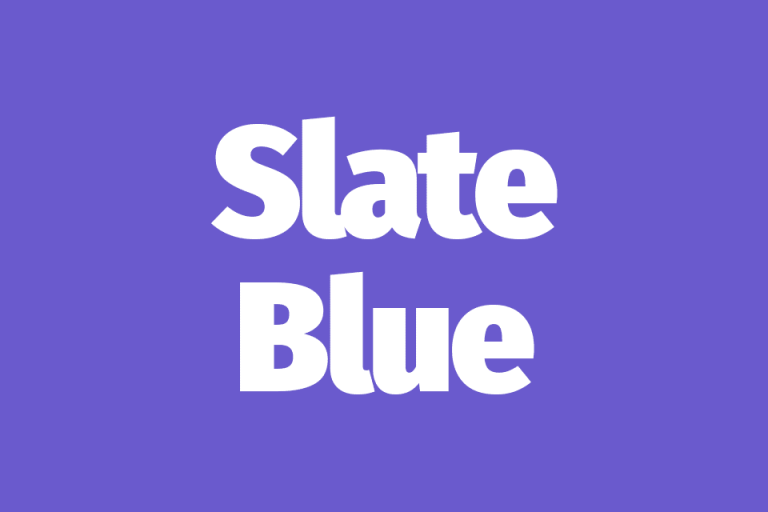
The slate blue color is a gorgeous shade of blue that effortlessly blends tranquility and elegance into one stunningly beautiful color! Picture yourself standing on a misty shoreline in the early evening staring out into an almost ethereal blend of…
Periwinkle is a mesmerizing color that truly captures the essence of serenity, elegance, and beauty! It is a delicate color that is a blend between blue and purple but unlike Indigo which is a deep bold color, the periwinkle color…
Violet is a bold color that has an air of sophistication and mystery to it! Not only is it a bright vibrant color but it is also incredibly eye-catching and has held a unique place in history being a favorite…
Amethyst is a color that has fascinated and enchanted people for ages! It is a color that is steeped in feelings of mystery, symbolism, and royalty and it has been used in art, design, fashion, and interior design for ages!…
Have you ever come across a color that just screams “Look at me!”? Well, that’s the striking chartreuse color, my friend! Found somewhere between green and yellow it is a color that radiates energy and vibrancy that is hard to…
Russet is a beautiful warm color that reminds me of Autumn leaves and rustic log cabins deep in the woods! I find it to be a nostalgic color that is very earthy and it has a warmth and charm that…
Teal is a beautiful and versatile color that has become quite popular over the last few years with you often seeing it being used in interior design and fashion. Teal is a cool, calming color that creates a relaxing atmosphere…
Today we are going to take a look at the enchanting hunter green color! It is a beautiful shade of green that has deep, earthy tones that truly embody the essence of nature – rolling hills, lush green forests, and…
Humans are beautiful and diverse creatures! We come in all shapes and sizes and our physical appearance and skin tones are what make each of us truly beautiful and unique! Not only are skin tone color palettes used in art…
Both green and yellow are beautiful colors that people associate with the natural world so they are a great color choice if you want to create a feeling of freshness, growth, renewal, happiness, and optimism! In this article, we are…
Orange is a warm, vibrant color that people often associate with energy and happiness, and because many also associate it with autumn, it can also represent transition and change. Orange color palettes are a popular choice because they are eye-catching…
I don’t know about you but when I think of burgundy I think of school uniforms and wine! Not a likely combination I know! However, don’t be fooled, burgundy is a really versatile color that can be used in so…
Are you looking for a vibrant, eye-catching color to include in your designs? Then look no further than hot pink! This incredibly bold, bright, and playful color is a surefire way to grab attention and make a statement! Hot pink…
Pink and black are an incredible color combination that is visually striking and attention-grabbing and there is no doubt that this is a color combo that leaves a lasting impression! And, the best part about using pink and black color…
Pastel pink and other light pink color palettes are soft and delicate and are most often associated with femininity, romance, and innocence. These colors are pretty versatile and can be used in many different ways, from playful and whimsical all…
Both green and pink are colors that remind us of nature and growth! When I think of pink and green color palettes, I immediately think of flowers, roses, and watermelons! Because people often associate these colors with the natural world…