This post may contain affiliate links which means we might earn a small commission if you decide to make a purchase through them (at no extra cost to you). Need more info? Click Here
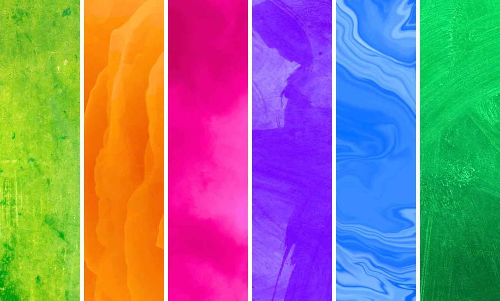
When it comes to color, there are the basics: primary colors and secondary colors. Both of these play a fundamental role in color theory and how colors are created. But things would be really boring if we stopped there right? Today we are going to look at the exciting topic of tertiary colors!
If you haven’t looked into primary and secondary colors yet, then make sure to check out our previous articles on Primary Colors and Secondary Colors. They’ll provide you with a solid foundation for everything we will cover in this article.
If you enjoy this Tertiary Colors Guide, please pin it!
We would appreciate it 🙂

What Are Tertiary Colors?
Tertiary colors are those colors that are created by mixing a primary color with a secondary color.
Tertiary colors can be used to create a wide range of different color palettes, from warm and inviting to cool and calming. They are also useful for creating contrast and adding depth to a design. To understand these colors, we first need to understand how primary and secondary colors work.
In our previous articles, we looked a the differences between the RYB and RGB color models and how their primary and secondary colors differed.
Here is a quick summary of the differences between the RYB and RGB color models:
RYB Color Model
- Used in art (pigments)
- Primary colors: Red, Yellow, Blue
- Secondary colors: Green, Orange, Purple

RGB Color Model
- Used in digital design (light)
- Primary Colors: Red, Green, Blue
- Secondary Colors: Cyan, Yellow, Magenta

How Are Tertiary Colors Created?
Tertiary colors are created by mixing equal amounts of a primary color with a secondary color on the color wheel – typically its neighboring secondary color.
By creating colors in this way, you can create new colors that are unique and add depth and complexity to your designs. Of course, the amount of each color you use will determine the final shade of the tertiary color.
How Many Tertiary Colors Are There?
There are six tertiary colors in both the RYB and RGB color models.
These six tertiary colors fill the gaps between the primary and secondary colors on the color wheel, giving you a wide range of colors to choose from when creating your color palette.
RYB Tertiary Colors (Art)
Let’s jump in and take a look at the RYB tertiary colors.
RYB Tertiary colors are the colors that are used in traditional art where pigments and paints are used to create colors.
The six RYB tertiary colors are:
- Red-Orange
- Yellow-Orange
- Yellow-Green
- Blue-Green
- Blue-Purple
- Red-Purple
Tip! To make it easier, the tertiary color names are displayed in the following format [primary color]-[secondary color].
For example, Red-Orange is a mixture of red (primary) and orange (secondary).
RYB Tertiary Color Table
Here are the six tertiary colors that are created along with the primary and secondary colors they are created from:
| Primary Color | Secondary Color | Tertiary Color |
|---|---|---|
| Red | Orange | Red-Orange |
| Yellow | Orange | Yellow-Orange |
| Yellow | Green | Yellow-Green |
| Blue | Green | Blue-Green |
| Blue | Purple | Blue-Purple |
| Red | Purple | Red-Purple |
RYB Tertiary Colors On The Color Wheel
The easiest way to visualize what these colors look like and how they are created is by using a color wheel! As you can see, each tertiary color is found alongside the primary and secondary color that is used to create it.

Examples of Tertiary Colors
The exact color of each tertiary color can vary depending on the hues, shades, tints, and tones that you use. Let’s take a look at a few different colors that can fall within the color spectrum of each tertiary color.
Red-Orange
Red-orange is a warm color that is created by mixing red and orange. It is an especially popular color in fall and autumn-themed designs. Some examples of red-orange colors include:
Vermilion
#FF4000
Scarlet
#FF2000
Persimmon
#FF6000
Burnt Orange
#CC5500
Yellow-Orange
Yellow-orange is a bright and cheerful color that is created by mixing yellow and orange. It is also a warm color that is often used in designs where you want to convey a sense of energy and excitement. Some examples of yellow-orange colors include:
Amber
#FFC000
Goldenrod
#DAA520
Sunflower
#FFDA03
Honey Orange
#FFBD31
Yellow-Green
Yellow-green is a fresh and lively color that is created by mixing yellow and green. It is often used in designs that want to convey a sense of growth and renewal. Some examples of yellow-green colors include:
Chartreuse Green
#7FFF00
Lime
#C0FF00
Lemon-Lime
#E3FF00
Pear
#D1E231
Related: Chartreuse Color Guide
Blue-Green
Blue-green is a cool and calming color that is created by mixing blue and green. It is often used in designs that want to convey a sense of tranquility and peace. Some examples of blue-green colors include:
Teal
#008080
Turquoise
#40E0D0
Teal Blue
#367588
Deep Teal
#005F5F
Related: Teal Color Guide
Blue-Purple
Blue-Purple is a deep, rich, and sophisticated color that is created by mixing blue and purple. It is often used in designs that want to convey a sense of luxury and elegance. Some examples of blue-violet colors include:
Indigo
#4B0082
Periwinkle
#8E82FE
Lavender
#E6E6FA
Slate Blue
#6A5ACD
Related:
Indigo Color Guide
Periwinkle Color Guide
Lavender Color Guide
Slate Blue Color Guide
Red-Purple
Red-violet is a bold and dramatic color that is created by mixing red and violet. It is often used in designs that want to convey a sense of passion and intensity. Some examples of Red-Purple colors include:
Magenta
#FF00FF
Deep Pink
#FF00A0
Phlox
#E000FF
Raspberry
#FF0060
RGB Tertiary Colors (Light)
RGB Tertiary colors are used in any device that uses light to create colors – televisions, computer monitors, mobile devices, etc.
These are the six RGB tertiary colors:
- Orange
- Chartreuse Green
- Spring Green
- Azure
- Violet
- Rose
Related: 75+ Orange Color Codes To Add Energy & Warmth To Your Website
RGB Tertiary Color Table
Just like the RYB tertiary colors, the RGB tertiary colors are also created by mixing equal amounts of a primary color and a secondary color. Here is a visual example of the six tertiary colors that are created along with the primary and secondary colors they are created from:
| Primary Color | Secondary Color | Tertiary Color |
|---|---|---|
| Red | Yellow | Orange |
| Green | Yellow | Chartreuse Green |
| Green | Cyan | Spring Green |
| Blue | Cyan | Azure |
| Blue | Magenta | Violet |
| Red | Magenta | Rose |
Related: Violet Color Guide
RGB Color Wheel
Once again, let’s take a look at what each color looks like on the color wheel.

Primary, Secondary, and Tertiary Hex Codes and RGB Values
I have to admit that I personally prefer working with the RGB color model because the color codes are more precise – here I have included a table to give you the color codes for each of the primary secondary and tertiary colors in the RGB color model.
The 12 Primary, Secondary, and Tertiary Colors (RGB Color Model)
| Color Name | Hex Color Code | RGB Value |
|---|---|---|
| Green (P) | #00FF00 | RGB(0,255,0) |
| Chartreuse Green (T) | #7FFF00 | RGB(127,255,0) |
| Yellow (S) | #FFFF00 | RGB(255,255,0) |
| Orange (T) | #FFA500 | RGB(255,165,0) |
| Red (P) | #FF0000 | RGB(255,0,0) |
| Rose (T) | #FF0080 | RGB(255,0,128) |
| Magenta (S) | #FF00FF | RGB(255,0,255) |
| Violet (T) | #8000FF | RGB(128,0,255) |
| Blue (P) | #0000FF | RGB(0,0,255) |
| Azure (T) | #0080FF | RGB(0,128,255) |
| Cyan (S) | #00FFFF | RGB(0,255,255) |
| Spring Green (T) | #00FF80 | RGB(0,255,128) |
How to Use Tertiary Colors in Design
By using tertiary colors in your branding, on your website, and in your designs, you can bring depth and visual interest to each of your projects. Here are a few tips to help you use tertiary colors in your designs.
Start with a Color Wheel
One of the best ways to choose colors is by using a color wheel! Because the color wheel is a visual representation of the primary, secondary, and tertiary colors it helps you to understand the relationships between these colors helping you to create color schemes that are visually pleasing.
Color Harmony
You can use tertiary colors to create beautiful color palettes that are harmonious and well-balanced by using an analogous color scheme. Analogous color schemes are created when you use three colors that are found next to each other on the color wheel.
For example, you could combine Rose, Violet, and Azure to create a beautiful, eye-catching color palette.
Rose
#FF0080
Violet
#8000FF
Azure
#0080FF
Of course, if you wanted to create a palette where the colors are even more closely related to each other you could use Rose, Magenta, and Violet.
Rose
#FF0080
Magenta
#FF00FF
Violet
#8000FF
Experimenting and playing with different shades, hues, and tones of each color will give you literally hundreds of colors to work with!
Contrast
You can use colors that are found opposite each other on the color wheel to create contrast in your designs – these are called Complementary Colors. Using these colors creates eye-catching and visually striking color combinations that are sure to catch your audience’s attention.
For example, you could pair Azure with Orange.
Azure
#0080FF
Orange
#FFA500
Or perhaps, Violet and Chartreuse Green
Violet
#8000FF
Chartreuse Green
#7FFF00
Balance with Neutrals
Tertiary colors work really well with neutral colors such as whites, blacks, and grays. By using neutral colors alongside your tertiary colors, you can enhance their vibrancy and appeal especially if you use them on top of a neutral background.
Accent Colors
Using tertiary colors as accent colors also works really well. You can use them to draw attention to a specific element or important piece of content. Whether it’s a call to action button or a block of text. Complementary colors work really well as accent colors.
Color Psychology
Different colors can evoke specific emotions and you can use these color associates to subconsciously influence people’s moods, perceptions, and behaviors.
By choosing the right colors for your branding, products, and services you can take advantage of a visual language that resonates with your target audience and helps you communicate your brand’s values and personality.
For example, Chartreuse green is often associated with growth, vibrancy, freshness, and nature and it is a great choice for brands that want to promote eco-friendly products or services.
Violot on the other hand is more of a calming color that has strong links to spirituality, creativity, and imagination. It is a great color choice for brands that promote spiritual or mediation-type products or even those that promote creativity and innovation.
For a much more thorough breakdown of how colors can affect moods and emotions, check out this article: Colors And Emotions – Use Color To Attract & Influence The Right Audience
Final Thoughts
Tertiary colors really open up the world of color to us! And when you expand on the tertiary colors with different shades, hues, and tones, you really have an endless number of beautiful colors to use for the perfect design!
I hope that you enjoyed this guide! If there is anything I’ve missed or if you have any questions, please let me know in the comments section below!


Great post! I never realized how important tertiary colors are in design. The hex codes you provided will definitely help me with my projects. Thanks for sharing such useful information!
Pleasure, I’m glad you found it helpful!