This post may contain affiliate links which means we might earn a small commission if you decide to make a purchase through them (at no extra cost to you). Need more info? Click Here
I love color! I find it fascinating how colors and emotions and interlinked and how they can impact our emotions, moods, and behaviors – often subconsciously. For example, did you know that red is often used in fast-food restaurant branding because studies have shown that red increases appetite and makes people more impulsive? Crazy right?!
Color is indeed a powerful tool!
As humans, we are surrounded by color all the time and because colors and emotions are so closely linked, it makes sense to explore how colors can be used to express yourself in your journaling or any creative pursuit.
In this color emotion guide, we will explore how colors and emotions are connected and what kind of impact different colors have when it comes to expressing yourself using more than words!
If you enjoy this Color Emotions Guide, please pin it!
We would appreciate it 🙂

Colors And Moods
How colors and emotions are related really is fascinating, especially when you see just how each color can affect someone’s moods and feelings.
But it isn’t just individual colors that affect us, colors can be broken down into a couple of groups with each group conveying specific emotions. Let’s take a look at a couple of these groups.
Warm Colors – Reds, Oranges and Yellows

Image: Pete Linforth from Pixabay
Warm colors such as red, orange, and yellow are uplifting colors that can make us feel energized, passionate, and even cozy. Think about how a warm fire or even a sunset can make you feel.
Warm colors are also attention-grabbing and are often used in signs and danger signals. For example, red is in stop signs, barrier tape, and hazard warnings.
You will see these colors used every day to create a sense of urgency and excitement. It’s no coincidence that Amazon is plastered with orange, red, and yellow attention-grabbing buttons!
Cool Colors – Blues, Greens And Purples

Image: Dorothe from Pixabay
Cool colors include blue, green, and purple. Cool colors have a calming effect on our emotions and they can make us feel relaxed, centered, and peaceful. Cool colors are often associated with water and ice.
While cool colors can be very soothing they can also sometimes be considered sad colors depending on how they are used.
Happy Colors

Image: Stefan Schweihofer from Pixabay
Happy colors are bright and uplifting colors that make us feel joy, enthusiasm, positivity, and optimism.
Warm colors are often happy and joyful colors!
As an example, think about yellow, it is often associated with sunshine, happiness warmth, and positivity.
However, colors such as various shades of pink, are also considered to be happy colors because they are linked to things like romance, friendship, and cotton candy!
Generally, bright colors are happy colors, and using them in your journaling can help you feel happy and positive.
Sad Colors

Image: Dorothe from Pixabay
Sad colors are those colors that are muted and have dark tones such as black and gray, as well as muted blues and greens. These sad colors often create a sense of heaviness and can sometimes be associated with grief, loss, mourning, and depression.
That said, sad colors can also be used in formal settings to create a sense of sophistication and elegance.
Calming Colors

Image: Wokandapix from Pixabay
Cool colors are often also calming colors. Cool colors such as blue and green create a sense of peace, relaxation, positivity, and tranquility. These colors have even been found to lower blood pressure and heart rate which is why they are often used in places like wellness centers and spas to create a peaceful and calming environment and atmosphere.
Energizing Colors

Image: Kai Pilger from Pixabay
Energizing colors are happy bright colors that are generally considered to be joyful and warm colors – Red, Orange, and Yellow! Energizing colors are uplifting colors that create a sense of positivity, happiness, passion, excitement, and energy.
Energizing colors are happy bright colors that are strong, and powerful and are used to grab attention, create a sense of urgency, and in general, a happy vibe!
Neutral Colors

Image: Chesna from Pixabay
Black, white, and gray are all neutral colors that are associated with simplicity, elegance, and sophistication. They are often used in minimalist and modern designs that want to create a sense of calmness and order.
But black, white, and gray are not the only neutral colors you can choose from. Neutral colors can also include muted and pale shades that seem to lack color. Think of beige, cream, and taupe as examples.
Neutral colors are the perfect backdrop for other colors and can be used to balance out bright and intense colors.
Earthy Colors

Image: Dorothe from Pixabay
These wonderful cool colors are inspired by nature and they include shades of green, gray, and brown. Earthy colors are uplifting colors that create a sense of warmth, comfort, calm, positivity, stability, and grounding and help you connect with the natural world in a powerful way.
Metallic Colors

Image: Dan Cristian Pădureț on Unsplash
Metallic colors are those that mimic the appearance of metals – gold, silver, and bronze. They create a sense of luxury, glamour, and sophistication.
Neon Colors

Image: rawpixel.com on Freepik
Neon colors are often associated with pop or cyberpunk culture because they are incredibly bright, bold, exciting, fun, and playful.
That said, neon colors can also be used to create a retro or nostalgic vibe.
How Each Color Makes You Feel
When it comes to colors and emotions, each color has its own unique way of affecting people and most people react subconsciously to the colors that they see. Let’s take a look at how each color affects emotions, feelings, and desires.
Black

The color black tends to create feelings of sophistication, simplicity, security, power, and elegance. However, depending on how it is used, black can also be seen as oppressive and cold.
White

White is a fresh, simple, clean, and uplifting color that in many cultures, is used to signify innocence and purity.
White is great for minimalistic designs that want to create a clean, simplistic look. When used with black it can feel modern and sophisticated.
Depending on how white is used it can create feelings of happiness and peace – think snow, marshmallows, and soft pillowy clouds! And don’t think that you are limited when choosing white for your color palette! There are lots of shades of white to choose from ranging from darker white colors to pastel pinks, blues, and yellows.
Gray

Gray is a mature, serious, and responsible color. It feels dependable and safe while also coming across as reserved and more conservative. Gray feels very practical and stable and depending on how it is used, different shades of gray can be calming, relaxing, and soothing.
Gray can however also be seen as a sad color that can bring feelings of pessimism with it.
Red

Red is probably one of the strongest, most vibrant and uplifting colors out there!
Red draws attention like no other color and it radiates passion, energy, fearlessness, and power. It symbolizes strength, action, energy, and passion and it makes you feel energized.
Many shades of red are often used to draw attention to important information, which is why it is often used in warning and danger signs and signals. It is also the color of love – valentines, roses, strawberries! Red is definitely a happy color!
Orange
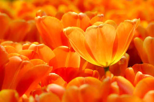
Orange is a bright, happy, positive, joyful and uplifting color that represents positive energy. Orange is linked to feelings of courage, warmth, confidence, creativity, fun, happiness and friendliness. Think about Nickelodeon’s awesome splat logo!
Just like red, orange is also used to draw attention to important information.
Orange is also a comforting and positive color – think about autumn leaves, sunsets, goldfish, and peaches! And because there are so many different shades of orange to choose from, you are spoilt for choice if you want to use orange in your color palette!
Yellow

Yellow is another warm, positive, and bright happy color that is optimistic, hopeful, uplifting, and cheerful! It is associated with sunshine and happiness. Think about all the happy things that different shades of yellow are associated with – sunflowers, sunshine, lemons, rubber ducks, and baby chicks!
Green

Green is the color of harmony, health, prosperity, and growth! It is a relaxing cool color that soothes our bodies and minds. It balances and revitalizes and makes us feel safe, secure, and hopeful. It has an organic, down-to-earth vibe and with so many gorgeous shades of green to choose from, you truly are spoilt for choice!
Blue

Blue is a cool color that symbolizes security, trust, loyalty, confidence, and responsibility.
Just like green, it is a calming and relaxing cool color that makes us feel at peace and secure. In fact, blue is the favorite color of most people in the world!
That said, you will notice that blue isn’t used very often for food brands. Why? It suppresses our appetites! So if you are opening a pizzeria, blue isn’t your color!
Related: 75+ Blue Color Codes To Help You Choose The Best Shades Of Blue
Purple

Purple is another cool color that is associated with wisdom, creativity, imagination, mystery, royalty, wealth, and sophistication.
Fun fact! Because purple is the color associated with royalty, Queen Elizabeth I banned anyone outside the royal family from wearing any shades of purple!
Purple is also often associated with spirituality and it inspires us to explore our innermost thoughts and feelings and encourages spiritual growth. Purple is an inspiring, uplifting, and encouraging color!
Pink

Pink is a happy color that is the most popular color to represent femininity. It is youthful, positive and imaginative and it has a playful and romantic vibe.
Just like red, pink is often associated with love and romance but it is also sweet and innocent. Pink is also kind, friendly, light-hearted, and comforting and can bring warmth and calm to our lives.
But just like other colors, you also get incredibly vibrant shades of pink that are bright and energetic!
Brown

Depending on how it is used, brown can also be a warm color that has a down-to-earth and dependable feel to it. It is practical, reliable, and somewhat old-fashioned. It is also a comforting color that is grounding and stabilizing.
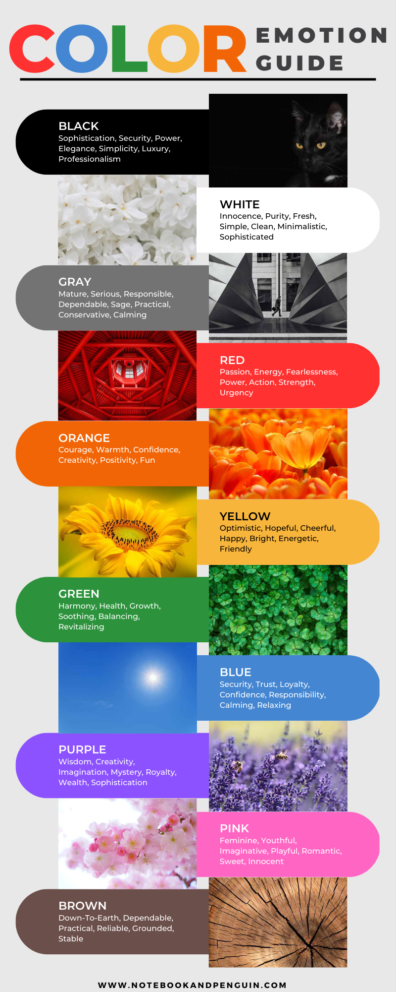
Colors Emotion Guide – Infographic
As you’ve seen, colors are more than just a visual experience as they can evoke a wide range of emotions. I’ve put together an infographic that summarizes this color emotion guide and the fascinating relationship between colors and emotions. I hope it will help you when choosing colors for your journaling!
Pin For Later…
Conclusion
Colors and emotions can be used to express yourself in ways that words sometimes just can’t! By choosing colors and color palettes that resonate with you, you are able to add an extra dimension to your journaling journey. I hope this color emotion guide has helped you get some great ideas to add to your journaling practice. Let me know if the comments section below!