This post may contain affiliate links which means we might earn a small commission if you decide to make a purchase through them (at no extra cost to you). Need more info? Click Here
Lavender is a beautiful pale shade of purple or violet that has become increasingly popular in recent years and it is a favorite color choice for many designers. But lavender isn’t just a gorgeous color, it also is a calming, soothing, and relaxing color that is linked to femininity, creativity, and even spirituality. And when cleverly used it can foster positive emotions while creating a sense of elegance and sophistication with a touch of whimsy!
Lavender also blends well with other colors. If you pair it with cool colors it can create a sense of tranquility while combining it with warm colors can create a warmer palette that is more energizing.
In this article, we are going to talk about how you can use the lavender color on your website, in your small business branding, or in your designs. We will go over what colors work well with lavender and all its different color variations. I’ll include color swatches and hex codes to help you choose the best colors.
Let’s dive in!
If you enjoy this lavender color guide, please pin it!
We would appreciate it 🙂

What Color Is Lavender?
The lavender color is a beautiful pale shade of purple that is found within the lighter side of the purple color spectrum.
Just like other purples, lavender is a blend of blue and red but with a much softer and cooler look and feel to it. It also has a hint of gray in it which adds to its soft, subtle tone.
It comes as no surprise that lavender is named after the beautiful lavender plant of the same name!

Lavender Hex Color Code & RGB Value
By using hex color codes and RGB values you can specify the exact color you would like to use in your designs. No guessing is required!
Lavender Hex Color Code: #E6E6FA
Lavender RGB Value: RGB(230,230,250)
Keep in mind that if you are going to want to print your designs, you will need to convert them from RGB to CMYK. For more information on why you need to do this for printing, you can check out our article on the differences between RGB values and CMYK color codes.
What Does The Lavender Color Look Like?
Lavender can be described as a soft, pastel purple color that is gentle and delicate. It has an airy feel to it that is light and uplifting.
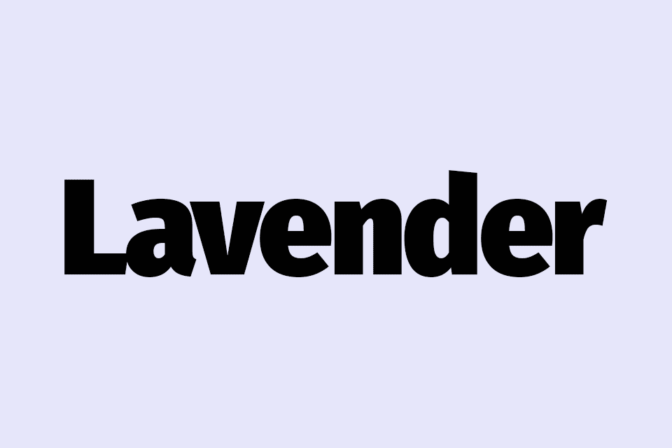
This is what the color lavender looks like:
Lavender
Hex Code: #E6E6FA
RGB Value: RGB(230,230,250)
PIN FOR LATER…

Is Lavender Pink Or Purple?
Lavender is neither pink nor purple. In fact, if you look at lavender against pink and purple you will see that it actually looks like it has more of a blue look and feel to it!
That said lavender is considered to be a shade of purple. It has a much cooler undertone with a much higher concentration of blue giving it a distinct purplish color.
This is what pink and purple look like versus lavender:
Pink
#FFC0CB
Lavender
#E6E6FA
Purple
#800080
Lavender vs Periwinkle
In our Periwinkle Color Guide, we explained that there are two different shades that are referred to as “Periwinkle”. The first is known as “True Periwinkle” and the second is known as “Periwinkle or Lavender Blue“. For this example, let’s look at the second periwinkle color, which is also known as Lavender Blue.
Lavender Blue or Periwinkle is a darker color compared to Lavender. However, they have very similar characteristics with both leaning towards more blue undertones. Both colors are soft and delicate and have a light and airy feel to them.
This is what lavender looks like compared to periwinkle:
Lavender
#E6E6FA
Periwinkle / Lavender Blue
#CCCCFF
Lavender vs Violet
Violet is a strong color that is deeper and a lot more intense than lavender. It is a lot darker and it is also bold and quite bright. It is a rich color that has depth and is a lot more saturated.
Violet on the other hand is a hang of a lot lighter and softer! It is much more of a muted or subdued color and when compared you can see the light gray undertone that lavender has. It has a gentle more delicate presence than bold violet!
This is what lavender vs violet looks like:
Lavender
#E6E6FA
Violet
#8F00FF
If you would like to learn more about violet, please check out our Violet Color Guide!
Lavender vs Lilac
Just like lavender, lilac is also considered to be a shade of purple. While both lavender and lilac are soft, more muted shades, they have qualities that make them look distinctly different.
Lilac has a very distinct pink undertone with many people wondering if it isn’t more of a pink color rather than a shade of purple. To me, it actually looks like a dusty pink color… what do you think?
Lavender on the other hand has a very much more pronounced blue undertone which makes it appear cooler than lilac with its warmer shade.
This is what lavender and lilac look like:
Lavender
#E6E6FA
Lilac
#C8A2C8
Lavender vs Mauve
Mauve is also considered to be a shade of purple and while both lavender and mauve fall within the purple color spectrum they are quite different! Mauve has a strong pink undertone whereas lavender’s undertone is a lot more blue with a touch of gray.
Mauve is described as a medium shade of purple while lavender is a light, pastel shade. Mauve is more intense and has more depth to its color whereas lavender is softer and more delicate.
This is what lavender and mauve look like when you compare them.
Lavender
#E6E6FA
Mauve
#E0B0FF
How To Create Lavender
In digital design, you can create lavender by combing different amounts of red, green, and blue (as can be seen from the lavender’s RGB value).
However, in art, no green is used to create the lavender. Instead, you can combine small amounts of red and blue pigments to a white base mixing until you get the desired lavender color. You may need to add slighter more blue to create its more blue undertone. Of course, you can also just add purple pigment to the white base to create the color you want.
What Will Lavender Look Like On Your Website?
To give you an idea of what lavender will look like on your website, I’ve created a couple of text examples for you. As you can see, lavender is not a great color choice if you are pairing it with white as there just isn’t enough of a contrast between the colors which makes it difficult to read. It does however work really well as a background color or even a text color on a dark background.
Lorum Ipsum
Lorum ipsum dolor sit amet, consectetur adipiscing elit. Vestibulum tristique facilisis tellus, sed consectetur nisi pulvinar at. Nulla fermentum sem id risus consectetur, vitae porta ipsum euismod.
Lorum Ipsum
Lorum ipsum dolor sit amet, consectetur adipiscing elit. Vestibulum tristique facilisis tellus, sed consectetur nisi pulvinar at. Nulla fermentum sem id risus consectetur, vitae porta ipsum euismod.
Lorum Ipsum
Lorum ipsum dolor sit amet, consectetur adipiscing elit. Vestibulum tristique facilisis tellus, sed consectetur nisi pulvinar at. Nulla fermentum sem id risus consectetur, vitae porta ipsum euismod.
Lorum Ipsum
Lorum ipsum dolor sit amet, consectetur adipiscing elit. Vestibulum tristique facilisis tellus, sed consectetur nisi pulvinar at. Nulla fermentum sem id risus consectetur, vitae porta ipsum euismod.
Popular Lavender Colors
Just like violet, there are lots of different lavender colors to choose from! Some look very soft and delicate, while others are a lot more deep. I’ve put together a set of color swatches to help you see what each color looks like if you are deciding on colors to use for your brand or website!
Lavender
#E6E6FA
Floral Lavender
#B57EDC
Lavender Blush
#645394
Dark Lavender
#734F96
Old Lavender
#796878
Languid Lavender
#D6CADD
Lavender Gray
#B6B5D8
Soap (Crayola)
#8A2BE2
Pale Lavender
#DCD0FF
Lavender Blue / Periwinkle
#CCCCFF
Pink Lavender
#DBB2D1
Wisteria
#C9A0DC
Amethyst
#9966CC
Lavender Purple
#967BB6
English Lavender
#B48395
Twilight Lavender
#8A496B
Related: Amethyst Color Guide
Lavender Color Shades, Tints & Tones
If you still haven’t managed to find a lavender color that you love, then you might enjoy taking a look through lavender’s different shades, tints, and tones. Here are a few color examples to get you started!
Shades Of Lavender
By adding black to the lavender color you can create different shades. The more black you add the darker the color will become.
| #E6E6FA | #CFCFE1 | #B8B8C8 | #A1A1AF | #8A8A96 |
Lavender Tints
Similarly, by adding white you can create tints of lavender that become progressively lighter until you finally reach pure white!
| #E6E6FA | #E9E9FB | #EEEEFC | #F0F0FC | #F3F3FD |
Tones Of Lavender
By adding gray to your base color you can create different color tones. In this case, the color becomes progressively more gray and it appears more muted and subdued.
| #E6E6FA | #DCDCEE | #D2D2E2 | #C7C7D5 | #BDBDC9 |
What Colors Go Well With Lavender?
Because lavender is such a soft color that looks almost white in some cases, it can work well with lots of different colors. From soft greens to pastel blues to pale yellows there are many colors that you can choose from. Here are a few ideas to get you started!
Lavender Complementary Colors
Our first palette includes a soft pastel yellow color with a very slight green undertone. This color is chosen because it is opposite lavender on the color wheel and it contrasts well against it.
#E6E6FA
#FAFAE6
Monochromatic Lavender Color Palette
Monochromatic color palettes are harmonious and balanced because they use shades and tints of the base color. In this case, I have used shades of lavender to create the palette which includes a slate blue color. And if you like slate blue, don’t forget to check out our full Slate Blue Color Guide!
#E6E6FA
#A2A2E0
#6868C7
Analogous Lavender Color Palette
An analogous color palette is created when you use colors that are next to each other on the color wheel. In this case, pastel pink and pastel blue are added to the base color to create a harmonious blend of colors.
#E6E6FA
#F0E6FA
#E6F0FA
Related:
Pastel Pink Color Palettes
Pastel Blue Color Palettes
Triadic Lavender Color Combinations
If you would like a little more contrast, then a triadic color palette could be what you are looking for. These colors are spaced out evenly around the color wheel.
#E6E6FA
#FAE6E6
#E6FAE6
Lavender Tetradic Color Combinations
And if you would like to add another color to your palette then try a tetradic color palette which includes four colors. These four colors are made up of two sets of complementary colors which create a beautiful mix of colors.
#E6E6FA
#FAE6F0
#FAFAE6
#E6FAF0
Lavender Color Meaning
Lavender is such a beautiful soft color and it reminds most people of the soothing and comfort of the natural world. This is especially true because of its link to the lavender plant which is not only gorgeous but also smells incredible.
The lavender plant is renowned for its therapeutic and healing benefits and it is used to promote relaxation while reducing tension, stress, and anxiety. Its aroma is uplifting and it helps to alleviate symptoms of depression.
In aromatherapy, lavender is known to have antiseptic and anti-inflammatory properties and its overall healing ability. So, it’s no surprise that the lavender color is also linked to many of these qualities!
Let’s look at a few of them.
Peace & Calm
Lavender is a soft color that creates a sense of relaxation, peacefulness, and calm. It is a very popular color in baby nurseries and it isn’t hard to see why!
Femininity
Lavender is seen as a delicate feminine color that is also linked to innocence and grace. You will often see it being used in products that are geared toward women and girls. This is especially true for skin and body care products. Of course, all these products also smell amazing!
Romance
Along with being a feminine color, lavender also is linked to romance and love, with a more innocent feel to it.
Nostalgia
Lavender can also evoke a sense of nostalgia and sentimentality bringing back memories and emotions tied to childhood and innocence.
Spirituality
Both the lavender color and its scent are linked to meditation and mindfulness. Because they are both calming and soothing they help people to connect to their intuition and spirituality.
Creativity
Just like other purple colors, lavender can help to encourage creative thinking, originality, and artistic expression.
Final Thoughts
Lavender is a wonderful color choice if you are looking for a brand or website color that is geared toward a feminine audience! If you would like to see other colors that are just as beautiful but a bit deeper, then don’t forget to check out the following color guides:
Amethyst Color Guide
Periwinkle Color Guide
Slate Blue Color Guide