This post may contain affiliate links which means we might earn a small commission if you decide to make a purchase through them (at no extra cost to you). Need more info? Click Here
The slate blue color is a gorgeous shade of blue that effortlessly blends tranquility and elegance into one stunningly beautiful color! Picture yourself standing on a misty shoreline in the early evening staring out into an almost ethereal blend of gray and blue hues. Now imagine that same color in your designs, on your website, in your decor, and in your wardrobe. Beautiful right? Slate blue is one of those colors that oozes understated sophistication and timeless appeal and it truly is captivating!
In this article, we are going to look at everything you might need to know about the slate blue color. I will include hex codes for each color we talk about along with color swatches so that you can see exactly what each color looks like.
Let’s begin!
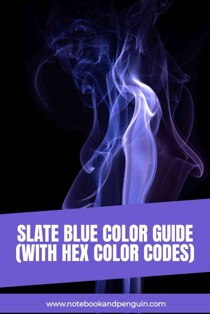
If you enjoy this slate blue color guide, please pin it!
We would appreciate it 🙂
What Color Is Slate Blue & What Does It Look Like?
Slate blue is a beautiful blue color that is a subtle blend of blue and gray.
It is described as a medium-toned blue that has a touch of gray added to it that makes it more muted and subdued. It can range from soft pale shades that make me think of weathered slate stone all the way to deeper and richer shades that are more like the ocean on a cloudy day. Because the slate blue color is a unique blend of gray and blue undertones, it is a very versatile color choice that goes really well with many other colors.
Slate blue gets its name from slate, a fine-grained rock that has a smooth texture with subtle variations of color. Slate naturally has many different shades including a bluish-gray color that looks like the slate blue color we know today.
What Does The Slate Blue Color Look Like?
Slate blue is a muted shade of blue that leans towards a medium blue shade. It is more of a subdued blue color that almost has a matte appearance to it especially when it is placed against other blue colors.
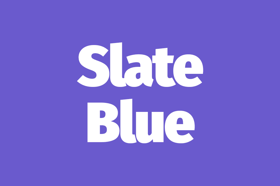
This is what slate blue looks like:
Slate Blue
Hex Code: #6A5ACD
RGB Value: RGB(106,90,205)
How To Create Slate Blue
The slate blue color is created by starting off with a blue base color and adding gray to it. The darker the shade of blue that you start with the darker your color will be. Of course, the amount of gray you add will also change the slate blue color you create.
This is what slate blue looks like against blue and gray to give you an idea of how the colors blend together:
Blue
#0000FF
RGB(0,0,255)
Slate Blue
#6A5ACD
RGB(106,90,205)
Gray
#808080
RGB(128,128,128)
Is Slate Blue A Cool Or A Warm Color?
The slate blue color is considered to be a cool color and has all the calming and soothing qualities that cool colors generally have.
Slate Blue Hex Color Code & RGB Value
The easiest way to pick the correct color for your designs is to use color codes, the most common of which are hex color codes and RGB color codes. Both these codes tell us exactly how much red, blue, and green must be used to create a specific color.
For a full breakdown of how RGB color codes don’t forget to check out our article on the differences between RGB color codes and DMYK color codes and why it’s important to know the differences between them.
Slate Blue RGB Value: RGB(106,90,205)
Slate Blue Hex Color Code: #6A5ACD
Slate Blue Color Comparisons
With so many different shades of blue out there, it can sometimes be tricky to know the differences between them. Here are some of the common blue colors that are often compared to or confused with slate blue.
Slate Blue vs Steel Blue
Both slate blue and steel blue are cool-toned blue colors that have a touch of gray in them. However, they look quite different. Slate blue leans more towards a purplish blue color while steel blue looks more like a teal blue color.
To compare, this is what slate blue looks like versus steel blue:
Slate Blue
#6A5ACD
RGB(106,90,205)
Steel Blue
#4682B4
RGB(70,130,180)
Slate Blue vs Dusty Blue
There are two blue colors that people refer to as dusty blue: #5A86AD and #8C9DAD. Both these colors have a distinctly dusty feel to them with their gray undertones being a lot more pronounced. These dusty blue colors also appear to be cooler and more muted than slate blue.
This is what slate blue looks like against the two shades that people refer to as dusty blue:
Dusty Blue
#5A86AD
RGB(90,134,173)
Slate Blue
#6A5ACD
RGB(106,90,205)
Dusty Blue
#8C9DAD
RGB(140,157,173)
PIN FOR LATER…

Slate Blue vs Periwinkle
As with dusty blue, there are two shades that people refer to as Periwinkle: #8E82FE and #CCCCFF. Both these colors look like lighter versions of the slate blue color with similar grayish undertones. Periwinkle however is a more delicate shade that is softer with pastel-like qualities.
If you like Periwinkle, don’t forget to check out our full Periwinkle color guide.
This is what slate blue looks like against periwinkle:
True Periwinkle
#8E82FE
RGB(142,130,254)
Slate Blue
#6A5ACD
RGB(106,90,205)
Periwinkle / Lavender Blue
#CCCCFF
RGB(204,204,255)
Slate Blue vs Navy Blue
Slate blue and navy blue are both deep rich shades that have their own unique characteristics. Navy blue is a darker color with a more intense blue shade and it has no noticeable gray undertones.
This is what navy blue looks like against slate blue:
Slate Blue
#6A5ACD
RGB(106,90,205)
Navy Blue
#000080
RGB(0,0,128)
Related: Navy Blue Color Palette Collection
Slate Blue vs Teal
Both slate blue and teal are unique eye-catching colors! They are quite different though. Slate blue has a very clear blue color to it while teal is a mixture of blue and green and when you look at them against each other, teal almost looks more green than blue.
This is what slate blue looks like vs Teal:
Slate Blue
#6A5ACD
RGB(106,90,205)
Teal
#008080
RGB(0,128,128)
If you would like to learn more about teal, then you can see our teal color guide here.
Slate Blue vs Baby Blue
Baby blue is a lighter, pastel-like shade of blue and it is known for its delicate soft appearance. Slate blue on the other hand has a more mature feel to it and it could be seen as a more sophisticated color.
This is what slate blue looks like compared to Baby Blue:
Slate Blue
#6A5ACD
RGB(106,90,205)
Baby Blue
#89CFF0
RGB(137,207,240)
Related: Pastel Blue Color Palette Collection
Slate Blue vs Royal Blue
Just like Navy blue, royal blue has a much more of a pure blue feel to it especially when you place it next to slate blue. Comparing the two colors you can see that slate blue is more subtle and understated whereas royal blue is a bold and vibrant shade that is quite confident and striking in its appearance
This is what slate blue looks like with royal blue:
Slate Blue
#6A5ACD
RGB(106,90,205)
Royal Blue
#4169E1
RGB(65,105,225)
Slate Blue Color Shades, Tints & Tones
As mentioned, slate blue is a very versatile color and there are so many different ways that you can use it. By using different slate blue shades, tints, and tones you can create monochromatic color palettes that are harmonious and very pleasing to the eye!
Slate blue Shades
Shades are variations of a particular color that are darker and deeper than the original base color. You can create different shades by combining the base color with black.
Here are a few examples of different Slate Blue shades:
| #6A5ACD | #5E51B8 | #5448A3 | #493F8F | #3F367A |
Slate Blue Tints
On the other end of the spectrum, you have tints which are lighter and brighter versions of the base color. To create tints, you simply need to add white to the base color.
Here are a few color swatches and hex colors for different tint colors.
| #6A5ACD | #796BD2 | #8A7ED8 | #9489D7 | #A39AD8 |
How To Create Slate Blue Tones
Tones of a color are those that are created when you add gray to the base color. These colors are usually more muted and more subdued than the original color.
| #6A5ACD | #695DBD | #6D63AF | #6D669C | #6F6A91 |
Colors That Are Similar To Slate Blue
While using different tones, tints, and shades of slate blue are a great option, sometimes you just might want some popular slate blue colors to use in your designs. Or even colors that are similar to slate blue. Let’s look at a few of these:
Slate Blue
#6A5ACD
Dark Slate Blue
#483d8b
Light Slate Blue
#B0C4DE
Cornflower Blue
#6495ED
Blue-Violet (Crayola)
#7366BD
Majorelle Blue
#6050DC
Resene Fuchsia
#7B5CB7
Medium Slate Blue
#7B68EE
Iris Blue
#5A4FCF
Plumb Purple
#5946B2
Max Blue Purple
#ACACE6
Indigo
#791CF8
What Will Slate Blue Look Like In Your Designs?
If you would like to use Slate Blue on your website or in your designs then I hope that the following text examples will give you an idea of what it could look like against black and white.
As you can see from the examples below, slate blue works really well with white. However, it doesn’t work quite as well with black so you may want to avoid this color combination especially if you are using it for text.
Lorum Ipsum
Lorum ipsum dolor sit amet, consectetur adipiscing elit. Vestibulum tristique facilisis tellus, sed consectetur nisi pulvinar at. Nulla fermentum sem id risus consectetur, vitae porta ipsum euismod.
Lorum Ipsum
Lorum ipsum dolor sit amet, consectetur adipiscing elit. Vestibulum tristique facilisis tellus, sed consectetur nisi pulvinar at. Nulla fermentum sem id risus consectetur, vitae porta ipsum euismod.
Lorum Ipsum
Lorum ipsum dolor sit amet, consectetur adipiscing elit. Vestibulum tristique facilisis tellus, sed consectetur nisi pulvinar at. Nulla fermentum sem id risus consectetur, vitae porta ipsum euismod.
Lorum Ipsum
Lorum ipsum dolor sit amet, consectetur adipiscing elit. Vestibulum tristique facilisis tellus, sed consectetur nisi pulvinar at. Nulla fermentum sem id risus consectetur, vitae porta ipsum euismod.
What Colors Go Well With Slate Blue?
There are quite a few colors that go well with slate blue. These include:
- Neutral colors such as white, creams, beiges, and grays
- Earthy tones such as olive greens, warm browns, sandy tones, and of course other blues.
- Pale yellows
- Silver accents especially in home decor
- Deep burgundy or other deep red shades
However, if you want to get a bit more technical about your color combinations, you could use the color wheel to help you choose the best colors to go with slate blue.
Where Is Slate Blue Found On The Color Wheel?
On the color wheel, slate blue is found within the blue color spectrum.

Slate Blue Complementary Colors
Complementary colors are colors that are contrasted against each other and you will find them opposite to each other on the color wheel. Here you can see that slate blue’s complementary color is a yellowish shade of olive green.
#6A5ACD
#BDCD5A
Related: Olive green color palettes
Monochromatic Slate Blue Color Combinations
Monochromatic color palettes have colors that are either shades or tints of the original color. These color palettes tend to be the most harmonious and balanced color palettes that you can create and can either contain colors shades and tints of colors that are lighter and/or darker than the original base color.
#6A5ACD
#7C73B4
#85819A
Analogous Slate Blue Color Palettes
Analogous color palettes are also harmonious and well-balanced color palettes because colors in these palettes are chosen from colors that are found next to each other on the color wheel. In this case, a medium purple shade and blue color are added to the palette.
#6A5ACD
#A45ACD
#5A84CD
Triadic Slate Blue Color Combinations
You will find that triadic colors are evenly spaced out on the color wheel so they create a mix of contrasting colors that complement each other well. In this case, we have a dusty shade of orange as well as a green chartreuse color in the palette.
#6A5ACD
#CD6A5A
#5ACD6A
Slate Blue Tetradic Color Combinations
If you love how eye-catching complementary colors are then you should definitely consider using a tetradic color palette where two sets of complementary colors are used in the same color palette. Here a chartreuse yellow color is used along with a dusty pink and a green color.
#6A5ACD
#CD5A84
#BDCD5A
#5ACDA3
With all the color wheel combinations that we’ve gone through, it is a good idea to experiment and play with tints, tones, and shades of each color until you find a color combination that you love. And of course, don’t forget to add neutral colors to the mix for more ideas!
Final Thoughts
If you are looking for a shade of blue that is unique and eye-catching then the slate blue color might just be the color for you! With its wonderfully clean, sophisticated, and calming vibes you simply just can’t go wrong! And don’t forget to check out our indigo color guide if you are looking for another color that is just as unique and interesting as slate blue!