This post may contain affiliate links which means we might earn a small commission if you decide to make a purchase through them (at no extra cost to you). Need more info? Click Here
Pastel color palettes have been a favorite for quite a while now, and it’s easy to see why! Their delicate, muted tones are perfect for creating designs that are soft and calming, and they have a unique charm that certainly is undeniable!
What Are Pastel Colors?
Pastel colors are a wide range of colors that are made by mixing white with a darker base color. And unlike the base color, which is usually a lot more bold and bright, pastel colors are a lot softer and have a light and airy feel to them and they are perfect for designs that want to create a sense of calm and relaxation. You will notice that these colors still look a lot like their base color, having the same characteristics, they are just a lot lighter.
How Pastel Colors Are Created
Let’s take a look at an example of how pastel colors are created. I’m going to use green in this example. Pastel green is created by mixing green and white – the more white you add to the color the lighter it will become. Adding white creates colors that become progressively softer and more muted.
#43A243
#72BD72
#A8D2A8
#C8E0C8
#DBECDB
#EBF2EB
What Colors Are Considered To Be Pastel Colors
Pastel colors are any colors that are a lot lighter and softer than the original color. They are muted and toned-down versions of the base color that range in intensity and saturation. They have almost a washed-out look with a low color intensity that makes them appear quite pale especially when compared to other colors.
Favorite Pastel Colors
There are literally hundreds of these beautiful colors that you can use if you want to create a pastel color palette! Here are a couple of examples of some favorite pastel colors to get you started!
Piggy Pink
#FDDDE6
Baby Blue
#A2C5EC
Pale Yellow
#FCEAAE
Lavender
#E6E6FA
Pastel Green
#C1E1C1
Are Pastel Colors Warm Or Cool Colors?
Pastel colors can be both warm or cool colors! This will very much depend on the base color that was used to create the color.
For example, blue is a cool color and if you create pastel blue, it will still have a cool feeling to it. Likewise, yellow is a warm color, and pastel yellow also has a warm feel to it.
Before we take a look at a few pastel color palette ideas, check out our latest product to help you easily create your own color palettes!
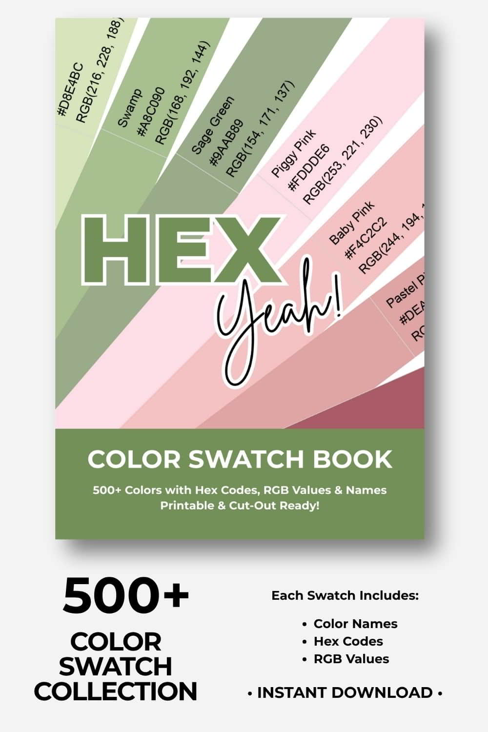
🎨Build Stunning Color Palettes
Cut, Mix, and Experiment With 500+ Colors!
Ready to build your dream color palettes? Our color swatch book gives you 500+ beautiful, printable color swatches to cut out, combine, and arrange by hand. Experiment, try new combinations, and turn your creative visions into reality! Includes hex codes and RGB values.
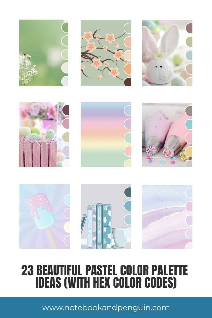
Pastel Color Palettes
Pastel colors are a perfect choice if you’re looking to create a gentle, subdued, and calming design! And with so many different color options to choose from, there are endless pastel color palette possibilities!
Don’t forget to check out our pastel blue color palettes and pastel pink color palettes if you would like to use these colors specifically.
Monochromatic Pastel Green Color Palettes
If you are looking for cool and soothing pastel color palettes for your journal then using shades of green is a wonderful option! Monochromatic color palettes are those that use different shades of a specific color, in this case green.

| #8BB075 | #B8CCA4 | #CFD8BB | #E7EADD | #E7EAEA |
This color palette is similar to the last one except that it has a darker hunter green accent color as its base color.

| #507E55 | #76AB6F | #ACCA9D | #D7F0CE | #E9F7E1 |
Pastel Gray And Green
I must admit that this is possibly one of my favorite color palettes! It pairs shades of pastel gray with soft greens to create a color palette that is calming with a zen feel to it!

| #ACB49D | #C8CDBF | #E0E8D0 | #EBEEE3 | #FDFDFB |
Pastel Peach And Orange
Pastel peach and orange pair really nicely with a sage green and a dark brown accent color. This color combination creates a warmer color palette with contrasting colors creating interest.

| #BCC9B4 | #EFBFA7 | #F4DABF | #F1AE78 | #5C3C33 |
Easter Pastel Color Palette
No color palette collection would be complete without an Easter color combination!
Here different pastel shades are combined to create a contrasting color combination that isn’t too light or bright. The colors are a little deeper than many of the other Easter color palettes that you find.

| #9A7777 | #BEC395 | #B2CDCC | #CEBDAE | #E1D7BB |
Easter Color Palette With Maroon Accent
Pastel colors combine really well with dark colors and this is a perfect example! A shade of maroon is used to create a strong base color on top of which the softer shades are displayed.

| #73475D | #D19EAE | #CECDAC | #DBD1E0 | #F5F8F9 |
Pastel Rainbow Color Palette
This rainbow color palette is a great example of the colors that are traditionally used in Easter color palettes. Of course, these gorgeous colors are also a favorite in many a baby’s nursery!

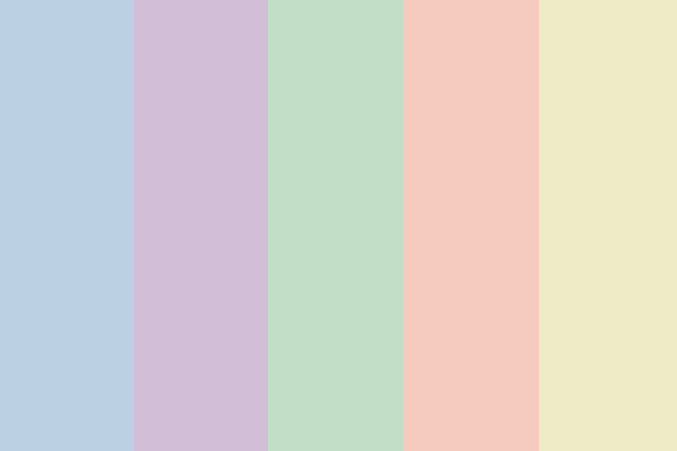
| #BCD0E4 | #D3BED7 | #C2DEC7 | #F5CABF | #EFEBC6 |
Airy Rainbow Color Palette
This color palette is very similar to the previous one however the colors used here are a lot softer and a lot more light and airy.

| #DAEFEE | #ECDFF3 | #FEDBDC | #F0F3DA | #FFF8C7 |
Soft Orange And Gray Palette
Pastel oranges work really well with grays and different shades of pastel blue creating contrasting color palettes that are eye-catching.

| #F0C7A8 | #EED2B8 | #E9D6C5 | #DFD8DE | #EEECED |
Teal Blue, Pink, and Yellow Palette
Pastel color palettes don’t always need to be very pale and muted. Here’s a great example of that. This palette uses a teal blue color, pink and yellow to form an eye-catching color combination that is paired with two different shades of gray.

| #978C8B | #94CECF | #E9BECB | #E6D08F | #CFC7C7 |
Soft Purple Color Palette
You can never go wrong with using light purple and lavender if you are wanting to create a soft and feminine color palette!

| #A091AE | #C5B0E0 | #D9CBE2 | #D6CFD2 | #C7CAB5 |
Pastel Purple and Gray Palette
This palette is similar to the previous one but it uses quite a stark shade of white to contrast against the different purple colors.

| #DFC6F4 | #D2C6DE | #DED2E0 | #DFDAD7 | #FDFBFC |
Pastel Purple and Pink
Contrasting light pink and purple colors against each other also works really well. This color palette almost has a nostalgic feel to it. What do you think?

| #C4BFDB | #F7CBD1 | #F2DADB | #F6E5D7 | #F5F1EB |
Light Blue, Pink, And Yellow
Another palette that contrasts the pastel colors beautifully against each other!

| #C9F1F6 | #EAD2EA | #FEFDE6 | #DDD8ED |
Watercolor Pastels
Pale pink, blue, and purple are another beautiful color combination that is a favorite in babies’ nurseries and you can see why!

| #DAE3F6 | #EAC9E2 | #E3D2E7 | #EADFEE | #F4EEF4 |
Light Retro Color Palette
I really love the combination of teal blue colors and peachy orange colors. The color combination has a unique look and it has a retro vibe.

| #75C8CC | #AFDFDB | #F3BBAE | #FBDCCF | #EBEAE5 |
Teal, Green And Peach
Similar to the previous palette, this palette uses more of a teal green color which is contrasted against the peach colors.

| #7CB4A2 | #B8DAC7 | #F0B29E | #F4E7DB | #DFC89D |
Warm Glow Palette
If you are looking for a warm pastel color palette then this might just be the one for you. This gorgeous warm color combination has a comforting feeling to it. Need it even warmer? Remove the gray color from the mix!

| #B5B9AA | #C1A395 | #E9C2AF | #F3E5CB | #E8DACC |
Dusty Color Palette
This color palette also has a retro, vintage vibe about it! And it certainly catches the eye!

| #E9BCA8 | #E4BA81 | #BED2C1 | #C7C3AE | #EED2BF |
Pastel Gray And Blue
This is a great example of a cool palette that uses blue and gray! Using the darker navy color as a base creates a good contrast in the colors.
If you compare this palette with the previous ones you can definitely see the difference between warm and cool color palettes!

| #516C78 | #7EB4C4 | #B2CDD6 | #E8F2F6 | #D9D9DD |
Neutral Pastel Palette
If you want to stick to a more neutral palette then you could consider using something like this! Soft pastel yellows are paired with cream and a pale brown.

| #D0C0A8 | #EBDAC5 | #E6E0C2 | #F2EBD4 | #FAF8E3 |
Soft Brown Color Palette
If you love the look of a more neutral color palette but would still like a darker accent color then this earthy brown color combination might suit you!

| #857245 | #B8AB8E | #D3C7AD | #C7C3AE | #F4F0E6 |
And Last But Not Least…
As mentioned, pairing pastel colors with darker accent colors can really create a dramatic effect in your designs.

| #6B5F83 | #9B7F92 | #CEACB1 | #F3D7CE | #A1A4C8 |
If you find these pastel color palette ideas helpful, please pin them!
We would appreciate it 🙂
Final Thoughts
There are many ways to get creative with pastel colors and I hope that this collection of color palettes has inspired you to play with these beautiful soft colors! If you would like more color palette ideas then don’t forget to check out our color palette library where you can search all the color palettes created so far by color!