This post may contain affiliate links which means we might earn a small commission if you decide to make a purchase through them (at no extra cost to you). Need more info? Click Here
When you use a blue and orange color palette, you create a stunning and eye-catching color combination that certainly won’t go unnoticed!
Why do blue and orange work so well together? One reason these colors work really well together is because they are complementary colors, meaning that they are found opposite each other on the color wheel. Because they are opposite each other they create a dynamic and vibrant contrast to each other when you use them together.
But before we begin, check out our latest product to help you easily create your own color palettes!
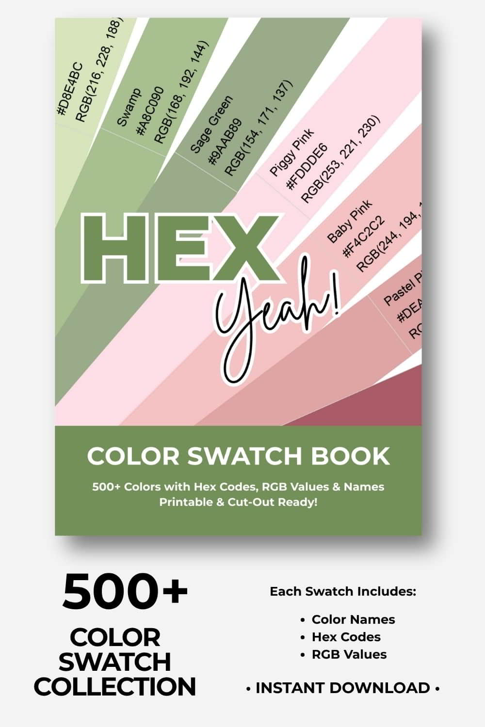
🎨Build Stunning Color Palettes
Cut, Mix, and Experiment With 500+ Colors!
Ready to build your dream color palettes? Our color swatch book gives you 500+ beautiful, printable color swatches to cut out, combine, and arrange by hand. Experiment, try new combinations, and turn your creative visions into reality! Includes hex codes and RGB values.
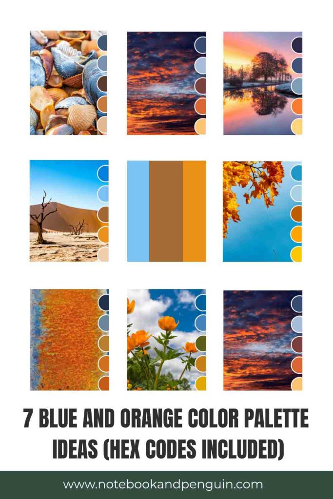
Blue And Orange Color Palettes
Blue and orange color palettes are so dynamic and beautiful and I love the richness of the shades that you can use!
Below you will find a few palettes that you can use right away. I’ve included a color code table below each picture with each color’s respective hex code that I hope will help you in choosing the best orange and blue colors for your design.
If you find these blue and orange color palette ideas helpful, please pin them!
We would appreciate it 🙂
Earthy Toned Blue And Orange Palette
I personally love the more natural and rustic color palettes. I find this color combination particularly beautiful with its misty and muted blues and oranges!

| #3E5978 | #7892B2 | #593B31 | #CA793A | #E2B88D |
Desert-Inspired Color Palette
This color palette is similar to the previous one however it is a lot more vibrant with its bright sky blues contrasted against the brighter oranges.

| #0081DC | #78C1F5 | #A46836 | #EC9019 | #EECEA9 |
Autumn-Inspired Orange And Blue Color Palette
No blue and orange color palette collection would be complete without an autumn-themed color combination! This palette contrasts vibrant sky blues with bright orange shades along with a splash of yellow to complete this bright and colorful palette.
Don’t forget to check out our yellow and blue color palettes if you would like to include more yellow in your design!

| #2096C8 | #A8CEE4 | #BE5F01 | #FEA400 | #FBC601 |
Moody And Dark Blue And Orange Palette
If you would like to tone down the colors you are using in your design, then this palette might be a great option for you! A dark navy blue combines with a darker maroon color which is, in turn, contrasted against lighter oranges and blues to create a more moody subdued look and feel.

| #384C75 | #A9BDDB | #7A3D3C | #D86732 | #F8C373 |
Cool Winter Color Palette
This is another example of a color palette that contrasts cooler blue shades with bright orange and soft pastel yellow. It creates a cool and clean look and feel that is still bright and eye-catching!

| #2E2947 | #425176 | #7F9CB7 | #FA7B30 | #FCD37B |
Summer Inspiration Blue And Orange Palette
This beautiful color palette includes shades of moss green, mustard orange, and yellow which contrast beautifully against sky blues.
If you would like to include more green in your palette, check out our blue and green color palette collection!

| #01609D | #4581BC | #5A5E19 | #C87E17 | #E3A800 |
Corporate Blue And Orange Color Palette
Blue and Orange are a great combination for brands and businesses that want to create a more corporate and serious color palette while at the same time still bringing the eye-catching contrast that orange and blue create.

| #242F48 | #698599 | #B77C2D | #CE701B | #C35D16 |
Final Thoughts
A blue and orange color palette is memorable and eye-catching no matter whether you use it in your interior design color scheme, your clothing, or in your journals If you would like to see more color palettes please let me know in the comments section below! Also, don’t forget to check out our color palette library where you can see all the color palettes we’ve created to date. You’ll also be able to search all the color palettes by color.