This post may contain affiliate links which means we might earn a small commission if you decide to make a purchase through them (at no extra cost to you). Need more info? Click Here
Are you looking for a vibrant, eye-catching color to include in your designs? Then look no further than hot pink!
This incredibly bold, bright, and playful color is a surefire way to grab attention and make a statement! Hot pink color palettes are simply impossible to ignore and because they are associated with passion, energy, confidence, and excitement, they are a great way to stand out from the crowd.
Don’t forget to check out our list of over 90 Pretty Shades Of Pink with their color codes (including hot pink)!
Colors That Go Well With Hot Pink
There are a few colors that go really well with hot pink so it is a good idea to experiment and play with your color palettes before deciding on a color palette for your brand. However, there are a few you should consider, these include:
- Warm colors such as bright oranges and yellows.
- For a modern and clean color palette, use white.
- For a sophisticated and elegant look and feel, use black.
- For an eye-catching contrast, try shades of blue and teal.
- For more natural and earthy color combinations, try using greens and browns.
- If you are looking for a color combination that is bold and intense, then try combining hot pink with red! But be careful, sometimes this combination can be a little overwhelming so you might need to add a bit of black or white to tone it down.
But before we begin, check out our latest product to help you easily create your own color palettes!
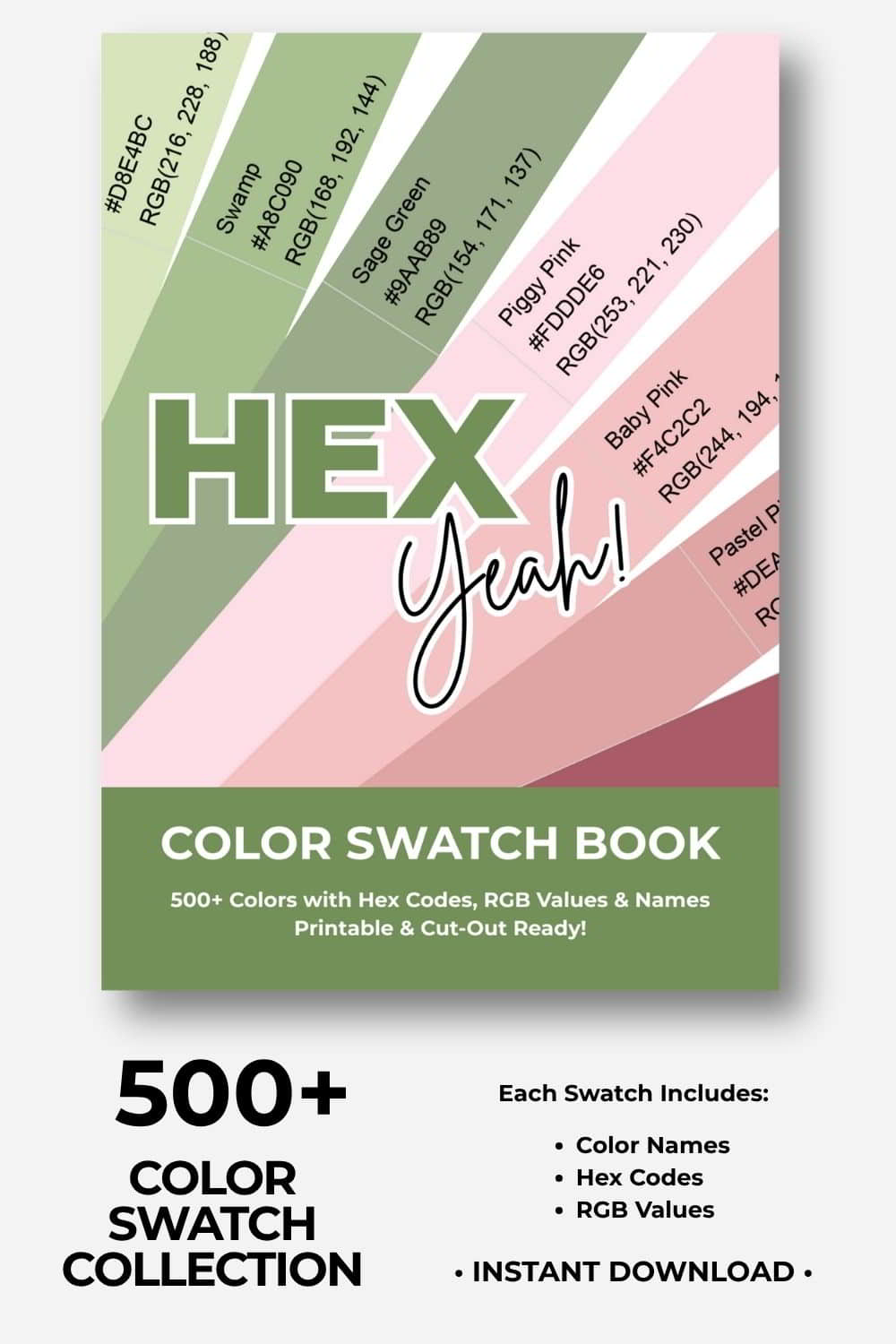
🎨Build Stunning Color Palettes
Cut, Mix, and Experiment With 500+ Colors!
Ready to build your dream color palettes? Our color swatch book gives you 500+ beautiful, printable color swatches to cut out, combine, and arrange by hand. Experiment, try new combinations, and turn your creative visions into reality! Includes hex codes and RGB values.
Hot Pink Color Palettes
And now, let’s take a look at some hot pink color palettes! If you need more ideas, don’t forget to check out the color palette library where you will be able to search for color palettes by color!
If you find these hot pink color palette ideas helpful, please pin them!
We would appreciate it 🙂

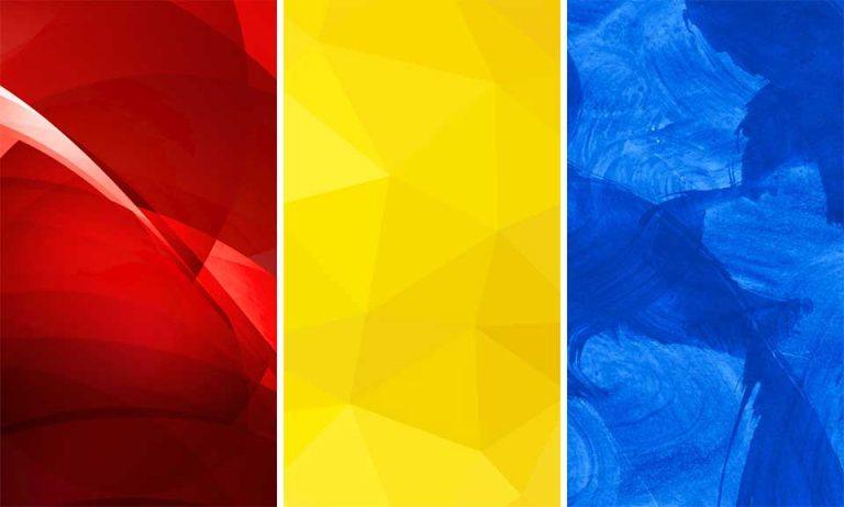
The Brightest Color Palette Ever!
Let’s get started with possibly one of my favorite hot pink color palettes! This palette uses a bright lime green color combined with a couple of orange shades. The bright contrast in these colors is truly show-stopping! Don’t forget to check out our other orange color palette ideas if you would like to use orange in your next project!

| #EC3EAB | #F765D3 | #CADB4D | #FA9A0B | #F86329 |
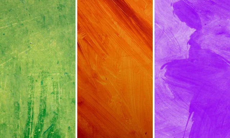
Earthy Pink Palette
If you want a natural, earthy color palette but would still like to use hot pink, then this might be the one for you! Shades of brown are combined with orange and yellow to create a warm and natural colored base with hot pink bringing a bright pop of color to the palette.

| #D33C8C | #F7B013 | #EC6316 | #BF7225 | #864340 |
Dark Olive Green And Hot Pink
This color palette uses a dark olive green color as a base that contrasts against the bright red, orange, and yellow colors in the palette. The dark olive green grounds the palette nicely and brings in a cooler tone to make it less bright and overpowering.

| #DE2344 | #F25B82 | #E35B03 | #F7A607 | #4C4820 |
The Perfect Pink And Red Valentine’s Color Palette
If you are looking for a Valentine’s color palette then look no further! Pink colors combine perfectly with red, and a pale white color to create this gorgeous, feminine color palette!

| #B5134D | #DE4F94 | #EDA4D2 | #EDC6D9 | #FAF5FB |
Black And Hot Pink Color Palette
If you are looking for darker accent colors in your color palette, then black or even brown are good colors to consider. In fact, this color palette (excluding the brown color) is very similar to Victoria’s Secret’s color palette! Check out more black and pink color palettes here.

| #221D19 | #E64883 | #E288B3 | #E3DCDA | #645141 |
Pink, Gray, and Black Palette
This beautiful palette contrasts black and a deep red color to create a bold color combination. Add shades of gray and you have a harmonious color palette that is pretty versatile.

| #120F10 | #615D61 | #D0D3D8 | #80124E | #DF67B6 |
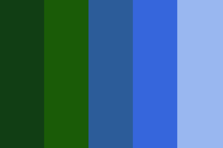
Pink And Pastel Blue
Pink and blue are contrasting colors that also create an eye-catching combination and when used together, balance each other nicely, depending on the shades of pastel blue and pink that you choose.

| #710835 | #FF69B4 | #F9C0EF | #567EBC | #A5A9D2 |
Hot Pink And Teal
Another color combination that is unusual, bold, and dynamic is that of hot pink and teal-colored blues. This striking combination is definitely not boring or understated!

| #264D73 | #20ADC7 | #43E8F2 | #F152A7 | #F092AF |
Final Thoughts
When deciding on colors for your journal or design, hot pink can be a color worth considering if you are looking for a color that is bright and bold! This is especially true if you want to create a feminine and youthful look and feel. I’d love to know what you think. Would you use any of these color palettes in your journal?