This post may contain affiliate links which means we might earn a small commission if you decide to make a purchase through them (at no extra cost to you). Need more info? Click Here
Orange is a warm, vibrant color that people often associate with energy and happiness, and because many also associate it with autumn, it can also represent transition and change. Orange color palettes are a popular choice because they are eye-catching and draw attention.
For this article, I’ve created a collection of orange color palette ideas that you can use for inspiration and each color palette comes with color swatches and hex color codes so that you can begin using specific colors within your digital journal right away!
Also, don’t forget to check out our complete collection of orange color codes if you are looking for more orange colors for your themes and designs.
But before we begin, check out our latest product to help you easily create your own color palettes!
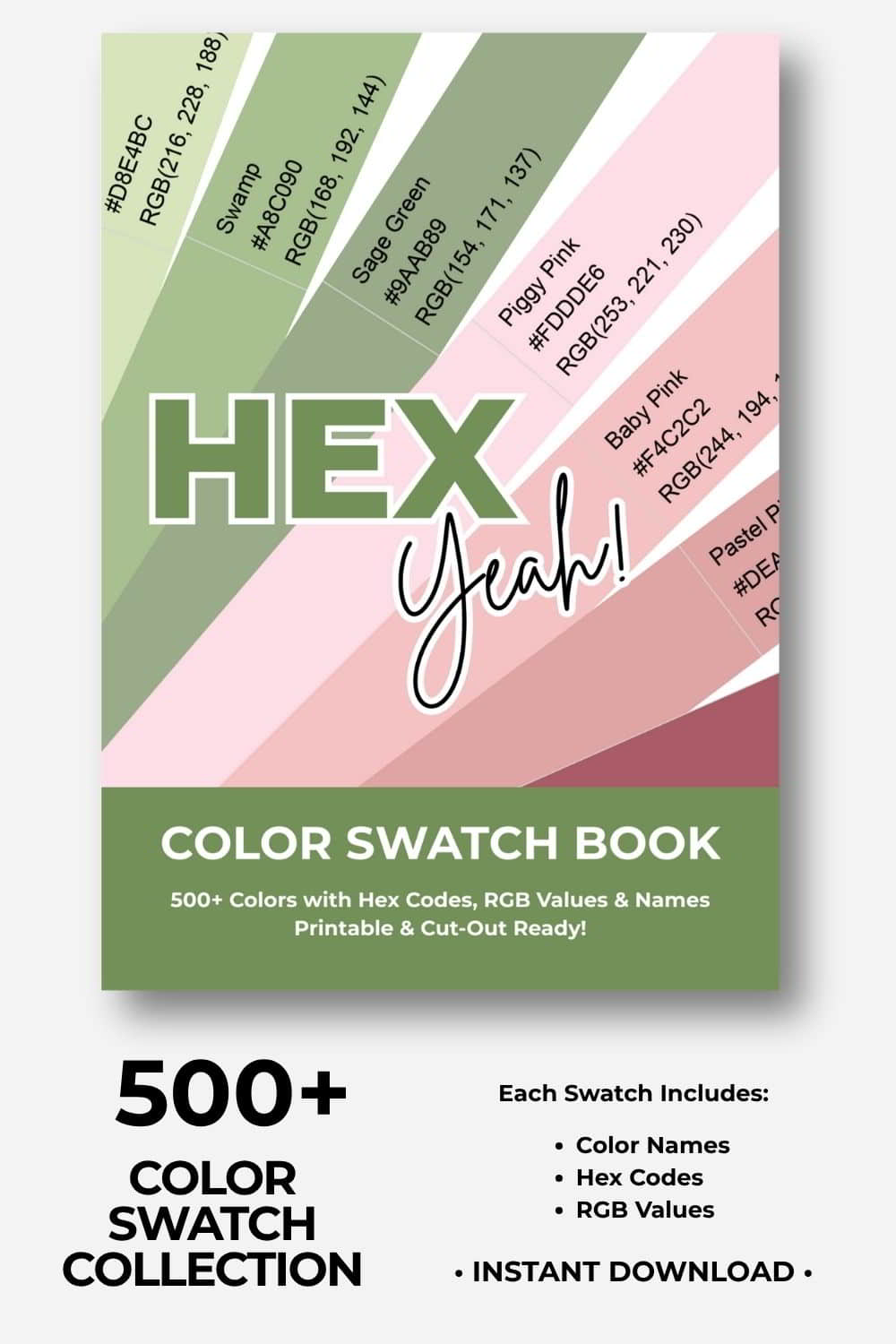
🎨Build Stunning Color Palettes
Cut, Mix, and Experiment With 500+ Colors!
Ready to build your dream color palettes? Our color swatch book gives you 500+ beautiful, printable color swatches to cut out, combine, and arrange by hand. Experiment, try new combinations, and turn your creative visions into reality! Includes hex codes and RGB values.
Orange Color Palette Collection
Let’s get started with our orange color palette collection! And don’t forget to check out our full color palette library, where you can also search for a color palette by color!
If you find these blue and yellow color palettes helpful, please pin them!
We would appreciate it 🙂
Monochromatic Orange Color Palette
First up is a monochromatic orange color combination that uses a range of different orange colors to create a harmonious and natural color palette.

| #813F07 | #A45814 | #C2721F | #EBA042 | #FEC562 |
Sunrise Color Palette
This palette takes advantage of strongly contrasted dark and light orange colors. Black is contrasted against yellow and burgundy to create a bright and vibrant color scheme.
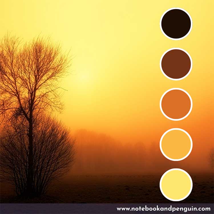
| #200F05 | #743315 | #DA7025 | #FBB841 | #FFE76E |
White and Light Orange Color Palette
This color scheme is similar to the previous one with the exception that the colors used are less bright. Combining light orange with white and a dark brown color a beautiful contrast of colors is created.

| #54380A | #EB6E26 | #E7A348 | #FFD8AA | #FFF5F1 |
Bright Orange Color Combination
Bright yellows are combined with a burgundy-red color to create a bright and vibrant color combination. Add white or a lighter shade of gray to round it off.

| #952807 | #E57609 | #F4AE0D | #FCE10D | #F0E7ED |
Gray With Burnt Orange Color Accent
If you are looking for a more neutral and natural color palette then this might be the one for you! Cool grays are combined with a bright splash of burnt orange as an accent color creating a showstopping contrast of colors.

| #24221F | #655E50 | #A4927A | #CDC4B5 | #D36811 |
Pastel Blue And Light Orange Color Palette
This color combination is a great choice for those who would like a more muted color scheme that doesn’t use shades that are too bright or bold shades. Combine light orange with pastel blue and a light gray shade and you have a soft pastel color palette that is calming and soothing.
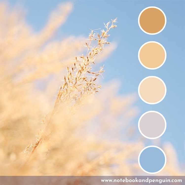
| #D9A366 | #F1C997 | #F3D9BD | #DAD1D3 | #97BADA |
Soft Rainbow Color Palette
This gorgeous rainbow color palette uses blue, green, pink, and yellow as its main colors. While not strictly an orange color palette, I wanted to include it because it shows how beautifully these rainbow colors work together and it is perfect if you want to create a light, bright, and playful vibe.

| #66A9CE | #A2C58A | #E484A6 | #E98561 | #E6C775 |
Burgundy, Orange, And Green
Burgundy mixes well with just about every shade of green and this color scheme shows how all three colors can be used together.
Don’t forget to check out our other burgundy color palettes if you want more ideas on what colors go well with burgundy.

| #7C4044 | #D97635 | #DCBF63 | #1D4542 | #5EA787 |
Floral Inspired Red, Green, and Orange Color Palette
Green and red are complementary colors on the color wheel so they create a strong color contrast when used together. Add burnt orange and a darker shade of yellow to the mix and you have a beautiful color combination!

| #BF2F06 | #D46615 | #E29123 | #656837 | #97997B |
Lime Green Accent
If you are looking for something with a very bright contrasting accent color, then you could try adding a bright pop of lime green as an accent color to an otherwise monochrome orange color palette.

| #55360E | #B12802 | #F45702 | #F79413 | #C2B824 |
Purple, Green, And Orange Palette
Instead of using darker brown, maroon, or black colors as your base color, try using purple! This color combination shows how you can use a dark purple color to contrast against burnt orange, dark forest green, and an olive green color.

| #431C50 | #CC5500 | #F5A102 | #625213 | #A38528 |
Autumn Color Palette
No orange color palette collection would be complete without an autumn-inspired color palette! Black, brown, and maroon are combined with a burnt orange and light orange shade to create this beautiful natural color combination.

| #241A17 | #6E391C | #9F2D13 | #C47332 | #E1BE91 |
Red And Orange Palette
This bright red color combination makes me think of a blazing hot fire! It certainly is eye-catching and bold with light orange toning it down a bit.
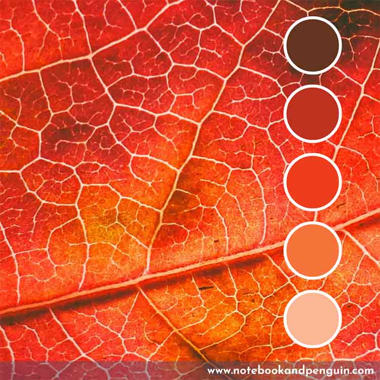
| #64341F | #BD311E | #EE3D1B | #F6743B | #FAB693 |
Burgundy, Pink, And Orange Color Palette
Another color combination that works really nicely is created when you mix different shades of pink and orange! Throw in a little burgundy into the mix as a base color and you have a winning combination!

| #711934 | #AD4985 | #C297BB | #B7491A | #C97B2B |
Hot Pink And Hot Orange
If you are looking for a bright neon-colored palette then you should definitely consider using hot pink combined with hot orange! And don’t forget to check out our hot pink color palettes as well as our pink and black color palettes if you are looking for more strongly contrasted color combinations.

| #E11451 | #DB258F | #E81FC5 | #FEA734 | #FFE76E |
Retro Purple And Burnt Orange Color Palette
Retro color palettes are back! This purple and burnt orange color combination shows how well these colors work together to create a retro vibe.

| #754846 | #CC5A25 | #C06A41 | #F6C698 | #4B3259 |
Corporate Orange and Teal Palette
If you are looking for a strong color combination for a corporate-type environment then you should definitely consider using a hot orange color and teal! If you like teal, then don’t forget to check out our other teal color palettes for more ideas!

| #262625 | #F98215 | #F69528 | #1D8E93 | #58B4C7 |
Ocean-Inspired Blue And Orange Color Palette
Mother Nature is truly the very best color palette creator out there! Check out this beautiful earthy and organic color combination that is perfect for nature journals where you want to create an earthy vibe.

| #BD7C4A | #DDAF6F | #A29E7F | #2C897E | #06636C |
Final Thoughts
Orange color palettes are versatile and dynamic and can be used for just about any design project, from home decor to branding and I hope that these color palettes have helped you come up with some great journaling color ideas!
