This post may contain affiliate links which means we might earn a small commission if you decide to make a purchase through them (at no extra cost to you). Need more info? Click Here
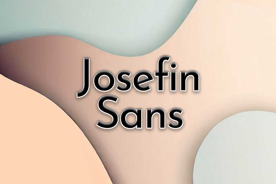
Josefin Sans is a beautiful modern sans serif font that is both elegant and versatile making it a great choice for many different projects, from branding to web design to print. It is a well-balanced font that has a clean design which makes it easy to pair with many different fonts. It was inspired by geometric sans serif fonts from the 1920s which gives it a vintage feel with a modern twist making it timeless and elegant.
Josefin Sans is part of the Josefin font family that also includes Josefin Slab.
What Does Josefin Sans Look Like?
Josefin Sans is a beautiful font that has a geometric shape to it and its letters look quite tall, especially in its thinner font styles.
It comes in a variety of different font weights ranging from Thin 100 for those looking for a skinny Google font, all the way to Bold 700 for those that need a heavier and bolder font. Each font weight also comes in italics giving you 14 different font styles in total.
Josefin Sans Thin 100
Josefin Sans Extra Light 200
Josefing Sans Light 300
Josefin Sans Regular 400
Josefin Sans Medium 500
Josefin Sans SemiBold 600
Josefin Sans Bold 700
If you would like to learn about how to pair fonts, then be sure to check out our guide on How To Pair Fonts for Beginners!
Josefin Sans Font Pairing Ideas
One of the best things about Josefin Sans is its versatility! It can be mixed with many other fonts to create different looks. Let’s take a look at a few great examples:
Josefin Sans And Montserrat
This is probably one of my favorite Josefin Sans Font pairings! I like it so much that it is the font pairing I use on this website!
Here I have created two examples:
- Josefin Sans (Header Text), Montserrat (Body Text)
- Monteserrat (Header Text), Josefin Sans (Body Text)
I don’t know about you but I think that Josefin Sans works really well as header text giving the header an open and more airy look and feel.
Much And More
When thy heart, love-filled, grows graver,
And eternal bliss looks nearer,
Ask thy heart, nor show it favour,
Is the gift or giver dearer?
George MacDonald
Much And More
When thy heart, love-filled, grows graver,
And eternal bliss looks nearer,
Ask thy heart, nor show it favour,
Is the gift or giver dearer?
George MacDonald
Would you like to experiment with your own font pairings? Check out our free Font Pairing Tool here!
Josefin Sans And Zilla Slab
If you are looking for a Josefin font pairing that has more of a classic look then you can pair it with a Serif font. In this example, I have used Zilla Slab but you can also use other fonts such as Vollkorn, Cardo, and Playfair Display.
A Crushed Leaf
An hour ago when the wind blew high
At my lady’s window a red leaf beat.
Then dropped at her door, where, passing by,
She carelessly trod it under her feet.
Josefin Sans and Josefin Sans
One of the easiest ways to pair fonts is to stick to the same font family. And because Josefin Sans has 14 different font styles you can really create a lot of different Josefin Sans font pairings simply by experimenting with things like font weight, italics, and uppercase and lowercase letters.
The Splendor Falls
Alfred Lord Tennyson
The splendor falls on castle walls
And snowy summits old in story;
The long light shakes across the lakes,
And the wild cataract leaps in glory.
The Splendor Falls
The splendor falls on castle walls
And snowy summits old in story;
The long light shakes across the lakes,
And the wild cataract leaps in glory.
Alfred Lord Tennyson
Josefin Sans And Lobster
Lobster is a beautiful Google font that has a very unique look to it. It has bold letters that are chunky and its flowing script style offers a great contrast to Josefin Sans. It also is a vintage style font so they could work well together in the right design.
Sympathy
A knight and a lady once met in a grove
While each was in quest of a fugitive love;
A river ran mournfully murmuring by,
And they wept in its waters for sympathy.
Josefin Sans And Six Caps
Six Caps is probably one of the narrowest fonts in the Google Fonts Library. Its tall letters are condensed and have a unique charm to them. It isn’t the best font for body text, but it does work really well for headings.
True To Poll
I’ll sing you a song, not very long,
But the story somewhat new,
Of William Kidd, who, whatever he did,
To his Poll was always true.
Is Josefin Sans Free For Commercial Use And Personal Use?
Yes, it is! You can download the Josefin Font for free from the Google Fonts Library. It is licensed under the Open Font Licence which means that you can use it in any of your projects, even commercial ones. You can see the licensing details here.
Conclusion
Josefin Sans is a sans serif font that has a unique look that gives it a timeless appeal. In this article, we looked at just a few suggestions for Josefin font pairings but there are many other possibilities to experiment with. If you would like to play with different font combinations don’t forget to check out our Google Fonts Pairing tool!