This post may contain affiliate links which means we might earn a small commission if you decide to make a purchase through them (at no extra cost to you). Need more info? Click Here
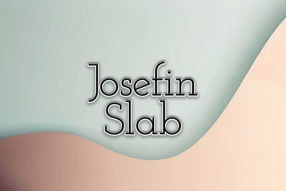
Josefin Slab is a popular Serif font that is known for its beautiful timeless look. It is one of those fonts that strikes the perfect balance between professionalism and uniqueness and it is often used in branding and marketing to create a sense of sophistication. It is a great choice if you are looking for a font with a clean modern look that has more of an unique look to it.
What Does Josefin Slab Look Like?
Just like its sans-serif counterpart, Josefin Sans, Josefin Slab was also inspired by the geometric fonts styles of the 1930s but with a contemporary modern touch. The font has a polished and professional look that can be used in many different types of designs.
Josefin Slab comes in 7 different font weights ranging from Thin to Bold which can add more contrast and personality to designs. It also comes in Italics which gives you 14 different styles in total.
This is what Josefin Slab looks like in its different font weights:
Josefin Slab Thin 100
Josefin Slab Extra Light 200
Josefing Slab Light 300
Josefin Slab Regular 400
Josefin Slab Medium 500
Josefin Slab SemiBold 600
Josefin Slab Bold 700
Josefin Slab vs Josefin Sans
Let’s take a quick look at the difference between Josefin Slab and Josefin Sans so that you can easily see the differences between both fonts in the Josefin font family. As you can see from the examples below, Josefin Slab has a thinner look to it with decorative serifs at the ends of the letters.
Josefin Slab Regular 400
Josefin Sans Regular 400
If you would like to experiment with your own font combinations then check out our free Google Font Pairing Tool!
Josefin Slab Font Pairing Ideas
Let’s jump right in and take a look at some great Josefin Slab pairing ideas!
Josefin Slab and Josefin Sans
If you have had a chance to look at my article about how to pair fonts, then you will know that one of the easiest ways to create a cohesive and appealing design is to combine fonts from within the same font family. You can create many different designs just by experimenting with font weights, italics and uppercase and lowercase letters. Here are a couple of Josefin font pairing examples that use only fonts from the Josefin font family:
Wishes
I wish we could live as the flowers live, To breathe and to bloom in the summer and sun; To slumber and sway in the heart of the night, And to die when our glory had done.
Dora Sigerson Shorter
Wishes
DORA SIGERSON SHORTER
I wish we could live as the flowers live, To breathe and to bloom in the summer and sun; To slumber and sway in the heart of the night, And to die when our glory had done.
Josefin Slab and Red Hat Display
Josefin Slab pairs really well with just about any sans serif font In this example, I’ve used Red Hat Display but you can use different sans serif fonts like Roboto, Poppins, Montserrat or Open Sans for example.
Quote Of The Day
If a man does not keep pace with his companions, perhaps it is because he hears a different drummer. Let him step to the music which he hears, however measured or far away.
Henry David Thoreau
Josefin Slab and Abril Fatface
Use a fatface font such as Abril Fatface to create contrast against Josefin Slabs’ narrow and delicate letters.
Nightwind
Darkness like midnight from the sobbing woods
Clamours with dismal tidings of the rain,
Roaring as rivers breaking loose in floods
To spread and foam and deluge all the plain.
John Clare
Josefin Slab and Lovers Quarrel
Because Josefin Slab has such a classic look, it tends to complement and pair well with decorate and flowing script fonts. I’ve used Lovers Quarrel in this example but there are many other script fonts that you can use to create this type of look and feel.
Wishes
I wish we could live as the flowers live, To breathe and to bloom in the summer and sun; To slumber and sway in the heart of the night, And to die when our glory had done.
Dora Sigerson Shorter
Josefin Slab and Gruppo
You can pair Josefin Slab with a wider Google font like Gruppo to create an interesting font combination. You can also try to pair it with an easy-to-read font like Lexend if you have body text that is small.
Much and More
When thy heart, love-filled, grows graver,
And eternal bliss looks nearer,
Ask thy heart, nor show it favour,
Is the gift or giver dearer?
Is Josefin Slab A Free Font?
Yes, Josefin Slab is a free font. It is licenced under the Open Font Licence which means that you are free to use it for both personal and commercial projects. You can download the font freely from the Google Fonts Library.
Conclusion
Josefin Slab is a versatile and stylish font that can be used in many different ways so whether you are choosing fonts for your branding, marketing materials or website design, it is definitely worth considering.