This post may contain affiliate links which means we might earn a small commission if you decide to make a purchase through them (at no extra cost to you). Need more info? Click Here
Fonts play an incredibly important role in website design, branding, and graphic design and when used correctly they are one of the most powerful ways of building a brand identity and communicating with your audience. By carefully selecting fonts, you can create a distinct personality for your brand and convey messages and evoke emotions without saying a single word! Fonts used in logo design are a perfect example of this!
In this article we are going to take a look at 5 different types of fonts and styles that you can use to create a sense of cohesion on your website and in your designs, enhancing the overall visual appeal of your content.
But first, here are a few key points…
Key Points
Font Styles: Fonts can be divided into different styles. These include serif, sans serif, slab serif, script, and decorative/display. Each font style has its unique characteristics and visual features.
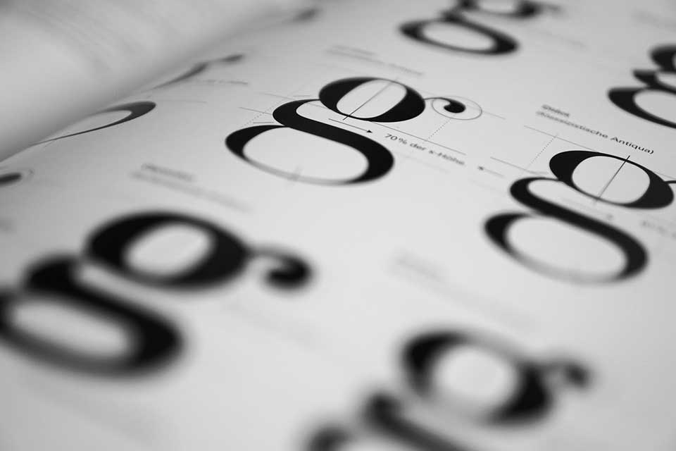
Serif Fonts: Serif fonts have small decorative lines or strokes at the ends of their letters or characters. They are often associated with traditional, classic, and formal designs.
Sans Serif Fonts: Sans serif fonts do not have any decoration. Instead, they feature clean, straight lines. They are known for their modern, minimalist, and clean appearance.
Slab Serif Fonts: Slab serif fonts are thick and block-like fonts that give them a bold and strong presence. They are suitable for designs that require impact and a contemporary feel.
Script Fonts: Script fonts look like cursive handwriting or calligraphy and they are characterized by flowing lettering. They add a sense of sophistication and personal touch to designs.
Decorative Fonts: Decorative fonts are unique and eye-catching, often featuring intricate designs, unusual shapes, or themes. They are used for special occasions or designs that call for a distinct visual style.
There are literally hundreds of thousands of fonts and font families out there to choose from! Luckily they are categorized into a few distinct categories, with each font type having unique characteristics that can convey a specific mood or emotion. Using these font styles you can easily find the type of font you are looking for so that you can create the right tone and context for your audience.
And if you are curious as to what exactly fonts are and how they fit in with design and typography then don’t forget to check out my beginner’s guide on The Basics of Typography and Fonts.
Serif Font Type
Serif fonts get their name from the small lines or decorative strokes at the end of each letter.
They are often described as being more traditional, formal, and elegant and are the go-to font type for things like wedding invitations! Serif font types are timeless and never seem to go out of fashion. They have been around for centuries and will more than likely outlive most of us!
Where To Use Serif Fonts
Because serif font styles are more formal and traditional they can be used anywhere where you need to add a touch of class and style. Here are a couple of ideas:
- Long-Form Content – Serif fonts are perfect for long-form printed text such as books, magazines, and newspapers. However, be careful when using them on screen because although they may look elegant they aren’t always the easiest to read on digital displays. Always test serif fonts before using them in blog posts and on social media.
- Formal Documents – Serif fonts are incredibly popular in formal documents such as legal documents. They add a touch of formality and tradition to any design and can make your text seem more professional.
- Elegant Designs – Because serif fonts come with a feeling of sophistication and style, they are a great choice for any type of design where you want to create an air of elegance. Think wedding invitations, menus, hymn books, etc.
Examples of Serif Font Types
Serif fonts can be further broken down into three different font categories.
Old Style Serif Fonts
Old Style serif fonts are characterized by their classic and timeless appearance. They create a sense of elegance and are more delicate and refined in their appearance.
Examples Of Old Style Serif Fonts
Garamond
Garamond is a font that is widely used in books and magazines and it is known for its old-style look and feel!

Baskerville
Baskerville is the perfect font style for high-end publications and branding. Although similar to Garamond, it seems to have a finer and sharper look compared to other old-style fonts.

Palatino
Palatino is a versatile Old Style serif font style that was designed by Hermann Zapf. It combines classic elements while adding a modern touch to the font.

Caslon
Caslon is another great example of an Old Style serif font that has a classic appearance.

More Examples Of Old Style Serif Fonts
Need more ideas? Here is a list of fonts that are considered to be Old Style serif fonts:
- Antiqua
- Arno
- Centaur
- Cloister
- Dante
- Emerson
- Fairfield
- Galliard
- Hoefler
- Janson
- Lexicon
- Sabon
- Yale
Transitional Serif Font Style
Transitional serif fonts are those that combine features of the Old Style fonts with more modern designs. They have both the elegance of the Old Style serif fonts along with the contrast and sharper details found in modern serif fonts.
Examples Of Transitional Serif Font Styles
Times New Roman
Times New Roman is one of the most widely used and recognized fonts in the world and you will often find it set as the default font in many applications. Times New Roman is also sometimes considered to be an Old Style serif font.

Georgia
The Georgia font is quite similar to Times New Roman however if you look closely you can see the subtle differences, especially in the letter “T”.

Bookman Old Style
Bookman Old Style is a transitional serif font that has more of a “sturdy” look and feel to it. It is quite versatile and just like Times New Roman, you will find it installed on most apps.

Perpetua
Perpetua is a graceful transitional serif font that is known for its unique look and refined appearance and it adds a touch of elegance to any text or print.

Neoclassical and Modern Serif Fonts
Both Neoclassical and Modern serif font types originated at the same time in the late 18th century. They were influenced by classical art and design as well as the desire to have more refined and geometric font designs.
Examples Of Neoclassical and Modern Serif Font Styles
Century Schoolbook
Century Schoolbook is a popular Moder serif font that has more of a uniform stroke style compared to other serif fonts. It is known for its balanced proportions and simple yet elegant design.

Rockwell
Rockwell is a distinctive font with a bold and robust appearance. It is a sturdy font with a square look and feel. Rockwell is often used in headlines, logos, and designs that need to create impact.

More Examples Of Modern Serif Font Styles
- Clarendon
- Aster
- Bodoni
- Didone
- Didot
- Ellington
- Mrs. Eaves
- Archer
Sans Serif Font Type
Sans Serif fonts are those font styles that don’t have any decorative strokes or lines in their designs. Unlike serif fonts, sans serif fonts are clean, straight, and modern and they have a minimalistic appearance. They are associated with simplicity and professionalism.
Where To Use Sans Serif Fonts
Because Sans Serif fonts have such a clean and modern design without any decoration, they are a lot easier to read, especially on screen. Because of this they are incredibly versatile and are a favorite in modern branding and advertising. Let’s look at a few places where Sans Serif fonts are used:
- Digital Design – Sans serif fonts are a great font choice for websites, mobile apps, and any other type of digital user interface. Because of their simple design, they are easy to read and suit digital applications well.
- Logos And Branding – Many people really like the simple look and feel of Sans Serif fonts because they create a contemporary and professional image. Of course, their modern feel makes them a great choice for brands that want to convey a sense of simplicity and clarity.
- Print – Just like their Serif counterparts, Sans Serif fonts are also often used in magazines, brochures, and posters because of their eye-catching styling.
- Titles And Headlines – Sans serif fonts are eye-catching and they grab readers’ attention so you will often see them being used in headlines especially if you increase the font size.
- Signage – Because Sans Serif fonts are so easy to read they are often used in signage to display important information clearly and effectively.
- Design, Infographics, And Presentations – If you are looking for fonts that are uncluttered and are able to present information clearly then Sans Serif fonts are great!
Examples of Sans Serif Font Types
Let’s take a look at some Sans Serif font examples! Just like traditional Serif fonts, Sans Serif fonts can also be further broken down into three different font styles or font families.
Grotesque Sans Serif Font Types
Grotesque fonts are known for their uniform stroke widths and have a straightforward, simple design that is clean and versatile. You will also sometimes notice that they have more of a retro feel to them. They can also be further broken down into subcategories like Neo-Grotesque fonts and Square Grotesque fonts.
Examples of Grotesque Font Styles
Arial
Arial is probably one of the most popular font styles out there and it is widely used because it has a clean and straightforward design. Arial is usually installed by default in many different apps and platforms and it is perfect for any type of digital application.

Franklin Gothic
Franklin Gothic is an impactful font that commands attention especially when you use bold variations of the font. It has a strong presence and is a great option for headlines, and posers.

Roboto
Roboto is a modern sans-serif font that was specifically designed for digital interfaces. It is versatile and easy to read even at small sizes so it is a great option for mobile apps.

Lato
The Lato font has a slightly rounded look and feel with balanced proportions and works well in both digital and print media.

Other Grotesque Sans Serif Font Examples
- Helvetica
- News Gothic
- Nexa
- Trade Gothic
- Monotype Grotesque
- Proxima Nova
Geometric Sans Serif Font Types
Geometric sans serif fonts are known for their more precise and structured design. They are geometric in shape and you will often see them being used in designs with a clean and minimalistic appearance.
Examples of Geometric Font Styles
Century Gothic
Century Gothic is a sans serif font that has a modern, clean look and it has characteristic rounded letters and it offers a good balance between classic and contemporary font styles.

Futura
Futura is a popular modern font that is visually appealing and easy to read. Its letters have a simple design that is often used in logos and headlines.

Montserrat
Montserrat is one of my favorite fonts! It has a clean appearance and is also very easy to read. It was inspired by the signage found in the Montserrat neighborhood in Buenos Aires, Argentina. It has quite an open look and feel about it making it easy to read even in small sizes.

Other examples of Geometric Font Styles
- Avant Garde
- Gotham
- Avenir Gotham
- Avenir
- Bauhaus
- Eurostile
- Raleway
- Univers
Humanist Sans Serif Font Types
Humanist sans serif fonts are inspired by human handwriting and calligraphy which gives them a more organic and approachable look and feel. You will see that the humanist fonts have varying stroke widths and they mimic the flow or handwriting.
Examples of Humanist Font Styles
Gill Sans
Gill Sans combines geometric and human-like letters that have a distinctive and balanced design.

Verdana
Verdana is a very easy-to-read font that was specifically designed for digital displays such as mobile devices and monitors. It has wide spacing and clean letters that make it ideal if the font you need must be small.

Fira Sans
Fira Sans is a great humanist sans serif font that has a contemporary and geometric design.

Other examples of Humanist Font Styles
- Droid Sans
- Calibri
- Lucinda Grande
- Trebuchet
- Tahoma
- Myriad
- Optima
- Frutiger
Slab Serif Font Types
Slab Serifs are robust and sturdy fonts that have a thick and rectangular appearance. They are very eye-catching so they are the perfect choice for bold headlines where you want to grab the attention of your audience. They have a modern, industrial feel to them and can range from having geometric shapes to distinct minimalistic designs. So, if you are looking for impactful fonts then Slab Serif Fonts are a great choice!
When To Use Slab Serif Fonts
Because Slab Serif fonts are so bold and eye-catching they can be used anywhere where you need to have an impact or draw the attention of your audience. Here are a few examples:
- Headlines – Headlines and titles are the perfect place to use slab serif fonts because of their strong presence and heavy strokes.
- Advertising and Branding – Slab serifs convey strength and professionalism and they create a memorable visual identity.
- Signage – Slab serifs are a great option for any large-format designs such as posters, signage, banners, billboards, etc. They are especially good to use when your audience is going to see your text from a distance.
- Packaging – You can use Slab Serifs to showcase and highlight product names and taglines on labels, boxes, and bags.
- Logos – Because Slab Serifs are attention-grabbing they are a great choice for logos!
- Web Design – You can use Slab Serifs to break up your typography and create interest on your web pages. They can also be used in key elements such as buttons. call-to-actions and headlines.
- Print Media – Things like magazine layouts and book covers can benefit from the distinct visual style of slab serif fonts. And depending on how you use them they can have either a modern or vintage feel to them.
Examples Of Slab Serif Fonts
Rockwell
Rockwell is also a font that falls into the Neoclassical and Modern Serif Font Styles families. It is also a classic slab serif font that has a bold look and feel that is perfect for headlines.
Courier
Courier is a slab serif that is known for its typewriterlike appearance. One of its notable features is its equal character widths and is very distinct retro look and feel.

Some Other Examples of Different Slab Serifs
- Clarendon
- Museo Slab
- Archer
- Sentinel
- Lubalin Graph
Script Font Types
Script fonts mimic cursive or handwritten styles and they convey a sense of elegance and creativity all with a personal touch. They can range from formal and ornate all the way to casual and playful.
When To Use Script Fonts
Script Fonts are a great option when you want to add a decorative elegant touch to your design. Here are some ideas:
- Invitations and Stariontary – Script fonts work really well for things like wedding invitations, announcements, and formal stationery especially when you are wanting to add personalization to your designs.
- Logos and branding – Script fonts can help to create a memorable and unique logo or brand identity and they work well for businesses that target women such as beauty, fashion, and luxury brands. And, just like slab fonts, script fonts can be used well for labeling and packaging. You will often see them on products such as homemade products, wine bottles, and gourmet food packaging. And if you pair them with slab fonts you can really create a gorgeous and eye-catching combination.
- Artwork – Script fonts add a sense of organic elegance and visual appeal when used on things like posters, wall art, greeting cards, or any type of artwork that has calligraphy included. If you have spent any time on Pinterest you are sure to have seen more than one quote written in gorgeous script fonts!
- Signage – If you have a business that wants to create a vintage vibe then you can’t go wrong with script fonts!
Examples Of Script Fonts
Script fonts can vary a lot in style ranging all the way from formal and elegant to casual and playful. When you choose a script font you will need to think about the mood you are trying to create while at the same time keeping in mind how easy it is to read the script font when it is printed or on screen.
Brush Script
Brush script is a classic script font that looks almost as if it has been hand-painted. It has a flowing appearance that has an artistic feel to it

Great Vibes
The Great Vibes script font is graceful and elegant and has a clear calligraphic style. It has a flowing look to it with intricate letters.

Lobster
Lobster is a bold script font that has a slightly vintage feel about it. Unlike some script fonts, it is quite eye-catching and its thicker and darker letters make it a great choice for logos.

Alex Brush
Alex Brush is a delicate font that has a beautiful feminine and elegant look to it. It has a smooth and flowing appearance and looks very much like traditional calligraphy. You will often see it being used in feminine brands or things like invitations and personal stationery that want to create an elegant and sophisticated vibe.

Allura
The Allura script font is also a sophisticated and versatile font that has a calligraphic feel to it. Just like Alex Brush, it is a great choice for stationery or any text that is aimed at a feminine audience.

Other Examples Of Script Fonts
- Dancing Script
- Pacifico
- Scriptina
- Madina Script
- Rosalinda
- Ballerina
- Playlist
- Bromello
- Kaushan Script
- Cookie
Decorative Or Display Font Types
Decorative or display fonts are specifically designed to grab attention and make a statement. These fonts have a very unique appearance and they vary a lot prioritizing the visual impact of the font.
When To Use Display Fonts
Just like Slab Sans fonts, display fonts can be used anywhere where you want to grab the attention of your audience including headlines, titles, logos, posters, signage, and any other design where you want a bold and distinctive look.
Examples Of Decorative Fonts
There are hundreds of different Decorative fonts out there to choose from and they can also be broken down into a couple of different font families. Let’s Look at a couple:
Blackletter Fonts
Blackletter fonts are also known as Old English fonts or Gothic fonts. They are fonts that have a medieval vibe to them with intricate letters and ornate features. Some examples include:
- Fraktur
- Textura
- Lombardic
- Old English
- Cloister Black
- Schwabacher
This is what the Cloister Black font looks like:

Retro/Vintage Display Fonts
Retro and vintage fonts have a sense of nostalgia and they make people think of vintage signage and advertising. Some vintage and retro fonts include:
- Retrofunk
- Bourbon
- Bellerose
- Lemon Milk
- Shintia
- Cast Iron
This is what the Retrofunk font looks like:

Graffiti Display Fonts
Graffiti fonts were created to mimic the style of urban graffiti and street art. They are edgy and have a rebellious look to them.
Some Graffiti display fonts include:
- Wildstyle
- Tag Type
- Street Soul
- RaseOne
- Throw-Upz
- Fat Wandals
- Brooklyn Kid
This is what the Tag Type graffiti font looks like:

Stencil Display Fonts
Stencil fonts have the appearance of stenciled letters. They are generally bold and quite distinctive with an industrial look and feel to them. Some examples include:
- Stencil
- Roboto Stencil
- Military Stencil
- Oswald Stencil
- Baron Stencil
- Compacta
- Impact
- Eurostile Stencil
- SF Fedora Stencil
- Univers Stencil
Here is an example of what the Stencil font looks like. You can see this font has quite a distinct military feel to it.

Web Safe Fonts
Web safe fonts are a set of fonts that are widely supported across many operating systems and devices. Using them ensures that you can specify what your website visitors will see when they visit your website. To learn more about web safe fonts, check out our web safe fonts guide which will give you a good overview of what web safe fonts are and how to use them.
Conclusion
Just like color, font styles play a crucial role in any type of design where you are using text. When chosen well they have the ability to establish strong brand identities and enhance visual appeal. By understanding the different types of fonts such as serif, sans serif, slab serif, script, and decorative you will easily be able to find the type of font you would like to use on your website or in our design.