This post may contain affiliate links which means we might earn a small commission if you decide to make a purchase through them (at no extra cost to you). Need more info? Click Here
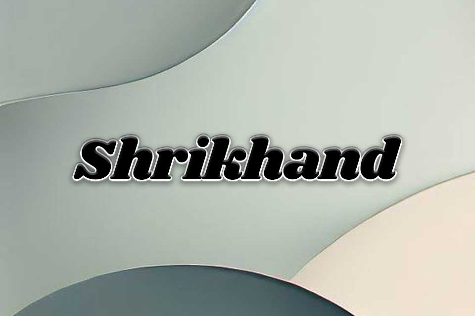
The Shrikhand font is a beautiful, elegant display font that has become quite popular over the last few years because of its unique look. It was inspired by traditional Indian calligraphy and features letters that are big, bold, and eye-catching making it ideal for posters, headlines, or any other text that needs to make a statement!
Fun Fact! The Shrikhand font gets its name from a traditional Indian dessert with the same name which is said to be a particular favorite of the font designer, Jony Pinhorn.
What Does The Shrikhand Font Look Like?
Shrikhand is a bold display font with wide and chunky letters that has an italic look to them. It comes in one font weight which is Regular 400. However, depending on what design package you are working with you could create bolder letters.
This is what Shrikhand looks like:
The Quick Brown Fox Jumped Over The Lazy Dog
Shrikhand Font Pairing Ideas
Shrikhand is one of those fonts that simply can’t be ignored! And because it is as big and bold as it is, it is important to pair it with fonts that do not overpower its visual impact.
Consider using complementary fonts such as modern sans serif fonts to help maintain a balanced and harmonious composition. Using these fonts will help to ensure that the Shrikhand font remains the focal point in your design.
If you would like to experiment with your own font pairings then check out our free Google Font Pairing Generator!
Shrikhand and Roboto
For a modern look and feel, you can pair Shrikhand with a sans serif font like Roboto, Open Sans, Montserrat, or Tenor Sans.
Quote Of The Day
Believe in yourself! Have faith in your abilities! Without a humble but reasonable confidence in your own powers you cannot be successful or happy.
NORMAN VINCENT PEALE
Shrikhand and Baskerville
For a more traditional look, you can pair Shrikhand with a more classic serif font like Baskerville, Lora, or Garamond.
A Psalm Of Life
Henry Wadsworth Longfellow
Tell me not, in mournful numbers,
Life is but an empty dream!
For the soul is dead that slumbers,
And things are not what they seem. Life is real! Life is earnest!
Shrikhand and Josefin Sans
In this example, Shrikhand is being used for the main body text which is dramatic and bold. It is paired with Josefin Sans which has more of a classic look.
As you can see, the Shrikhand’s bold letters contrast beautifully with the clean and minimalist look of Josefin Sans creating a harmonious font combination that is eye-catching and unique.
You can’t cross the sea merely by standing and staring at the water.
Rabindranath Tagore
Tips For Shrikhand Font Pairings
If you would like to use Shrikhand fonts in your designs then here are some tips to help you.
1. Body Text
While Shrikhand works incredibly well for heading text, be careful when using it for paragraph text or body text. As you can see from the example below, it can sometimes be hard to read especially at small sizes or from far away. It is best used for headlines, subheadings, or short quotes where you want to maximize its impact.
Heading Text
Lorem ipsum dolor sit amet, consectetur adipiscing elit. Sed at justo eget elit fermentum tristique. Nullam efficitur velit nec dolor efficitur, vel feugiat ex luctus. Duis et elit nec mi iaculis suscipit. Nullam cursus tellus odio, vel efficitur metus tincidunt quis. Ut quis leo sit amet lectus venenatis tincidunt. Sed nec risus tincidunt, luctus orci quis, fermentum odio. Pellentesque id metus at mi interdum malesuada. In vestibulum pharetra magna, vitae ultricies enim sollicitudin id. Proin ut tortor purus.
2. Font Size
Keep your design interesting by experimenting with different font sizes to create a visual hierarchy and add depth to your designs.
3. Letter Spacing
You can experiment with letter spacing to create even more design options making sure that the letters don’t become too tight or too loose.
Shrikhand Standard Letter Spacing
Shrikhand Wide Letter Spacing
Shrikhand Narrow Letter Spacing
4. Numbers
Shrikhand looks really great when used for numbers! So, it could be a great option for any marketing material where you want to promote lists or how-tos where you want to highlight the number of items within the list – think Pinterest Pins!
1 2 3 4 5 6 7 8 9
5. Balance With Whitespace
As with any bold and decorative fonts, it’s important to strike a balance between the text and the surrounding design elements. Be careful not to overcrowd your design and use whitespace to create breathing room around other elements.
6. Check Readability
As with any font, it’s important to make sure that Shrikhand can be easy to read in the context you are using it. If you are building a website, make sure that the font displays well on smaller screens and devices. Likewise, if you are using it on promotional material, check to see that it is legible even from a distance.
Is Shrikhand A Free Font?
Yes, Shrikhand is a free font that can be downloaded from the Google Fonts Library. It is licensed under the Open Font Licence which means that you can freely use it for both personal and commercial projects (you can check its licensing here).
Conclusion
Shrikhand is a unique and memorable font that is a great choice if you want to catch your audience’s attention. However, to make the most of its bold and eye-catching letters, it is important to choose Shrikhand font pairings that complement each other in such a way that Shrihand is allowed to shine as the focal point of your design whilst still maintaining readability and visual appeal.