This post may contain affiliate links which means we might earn a small commission if you decide to make a purchase through them (at no extra cost to you). Need more info? Click Here
Your home should be a sanctuary, a place where you can go to get away from the stress of everyday life to relax and recharge. One of the best ways to create a peaceful and cozy atmosphere in your home is through using color!
Colors can inspire different emotions and they can even influence your mood and by choosing the right colors for your home decor, you can create a space that feels calming, relaxing, and rejuvenating.
But, with so many different colors to choose from, where do you start?
In this article, I want to give you ideas on how to choose the perfect color scheme for your home, and by the end of the article, you should have a few great ideas to help you get started!
Before we begin…
If you find this article helpful, please consider pinning it!
We would appreciate it 🙂

Why Color Is Important When Creating A Peaceful Home
Have you ever walked into a room and felt instantly calm and relaxed? No matter whether you were at a cozy mountain lodge or simply visiting a friend, chances are that the colors used in that room played a big role in creating that peaceful atmosphere.
Let’s take a look at why it is important to choose the right colors for a peaceful and serene home.
Colors Can Reduce Stress and Anxiety
It has been found that colors can have a big impact on our stress levels. For example, bright reds, oranges, and yellows can actually increase stress and anxiety levels, while others, like blues, greens, and other natural colors are calming. This is why you will often see these colors used in places like wellness centers, spas, retreats, and even places like hospitals and counseling centers.
In a study conducted by Kutchma (2003), it was found that subjects in red room conditions had higher stress rating scores compared to green or white room conditions.
Blue colour was found to induce a stronger effect on the reduction of stress levels (Lubos, 2012). Calmer emotions were generally noticed by patients who were exposed to a blue room; pleasant, calming, restful and supporting concentration, thinking and meditation, suggesting the colours ability to reduce stress levels (Mahnke, 1996).
Spending time in natural green environments or even looking at pictures of green scenery in nature has been found to be linked with stress relief ( Gamble, Howard and Howard, 2014).
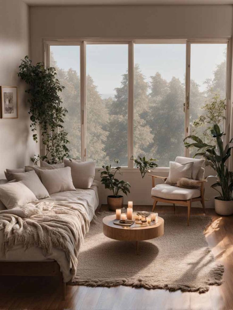
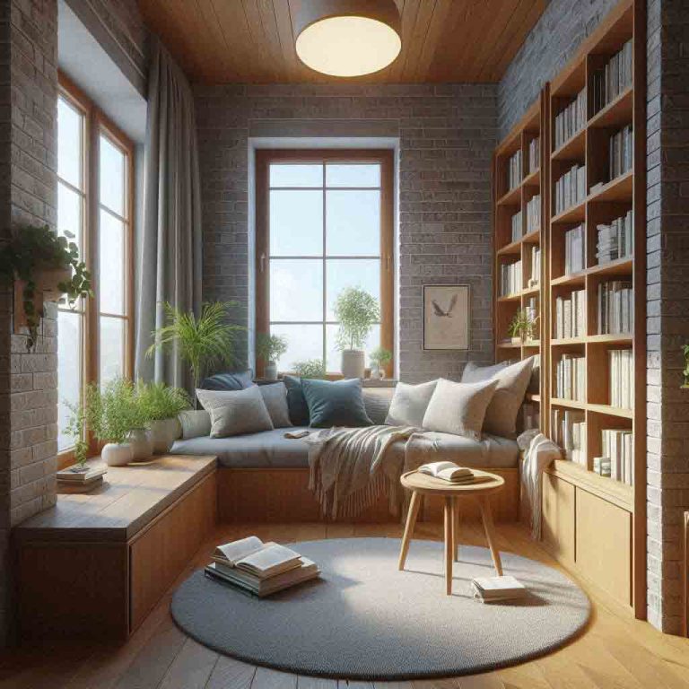
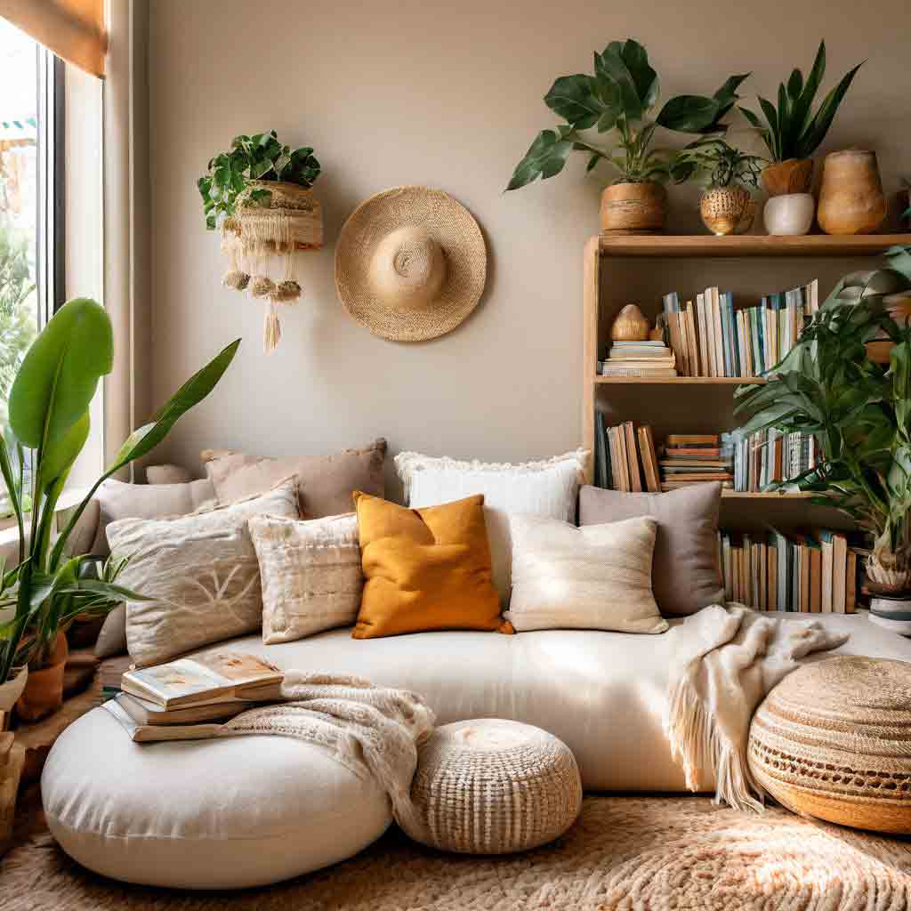
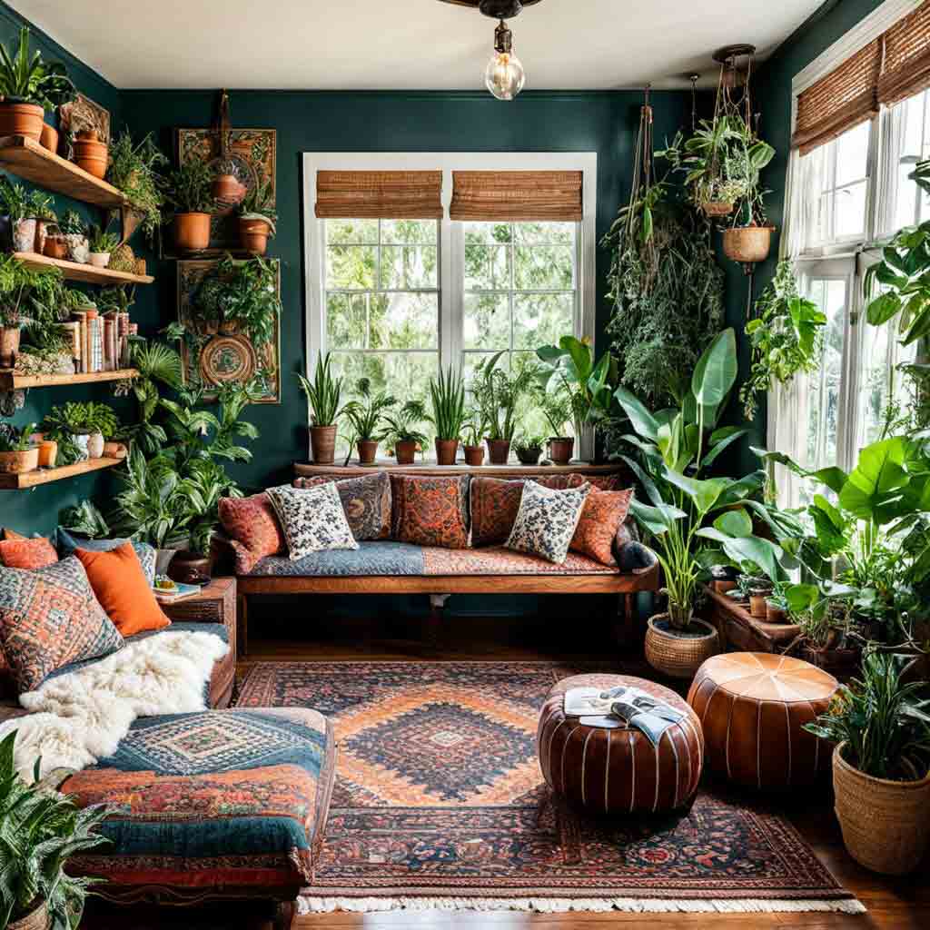
Colors Promote Relaxation and Calm
When we are surrounded by calming colors our minds and bodies relax and we feel more at ease which is especially important in our homes where we need to feel safe and relaxed.
Calming colors like light blue, sage green, and neutral tones can slow down our heart rate, lower our blood pressure, and even reduce muscle tension.
Natural colors like soft pinks and lavenders can also help you feel serene and tranquil while others like bold blacks and hot pink can create a sense of drama and tension.

Colors Can Help To Improve Sleep Quality
How we feel before we go to sleep can have a major effect on the quality of our sleep and using soothing colors in our bedrooms can help to calm and relax us after a long day.
The best bedroom color for sleep is one that calms you down as you prepare for bed. Although color preferences vary from person to person, research reveals that certain colors, such as blue and green, tend to promote more positive emotions and associations. On the other hand, some colors, such as red, may have more of a negative effect.
Blue and Red Bedroom Comparison
What do you think? Do you find the blue color palette in the first picture more peaceful and relaxing than the red color scheme?


Colors Can Boost Productivity and Energy Levels
Just like colors like blue and green can relax and calm you, certain colors like bright yellows and orange can actually help to lift your mood and energy levels. In fact, orange is a color that has been found to boost creativity and thinking.

Color Meanings and Associations in Home Decor
As mentioned, different colors can create different emotions and moods in people, and by understanding the meanings and associations of various colors, you can choose a color scheme that works for you.
Check out this article for a full breakdown of what emotions each color conveys when people see it.
In summary, these are the feelings that the most popular colors convey.
Of course, keep in mind that each of these colors comes in many different tones, shades, and tints so you can make them as light and bright as you like or as dark and subdued as you like.
| COLOR | ASSOCIATION | HOW TO USE |
|---|---|---|
| Black | Sophisticated, Powerful, Elegant | Black can add a sense of drama and luxury to a room, but can also make it feel dark and overwhelming if used excessively. |
| White | Simple, Clean, Pure, Innocent, Minimalistic | White can add a sense of brightness and airiness to a room, making it perfect for kitchens and bathrooms. |
| Gray | Mature, Serious, Responsible, Conservative, Safe | Gray can add a sense of calmness and serenity to a room, making it perfect for bedrooms and bathrooms. |
| Red | Passionate, Energetic, Strong, Action, Urgency | Depending on the shade, red can add a cozy and inviting feel to a room, but it can also be very overwhelming if used to much. |
| Orange | Courage, Warmth, Confidence, Creativity | Orange can add a vibrant and energetic feel to a room, but can also be overwhelming if used to much. |
| Yellow | Optimistic, Hopeful, Happy, Cheerful | Yellow can add a bright and cheerful feel to a room, but just like red and orange it can be overwhelming so use it sparingly. |
| Green | Harmony, Health, Growth, Security | Green can add a soothing and relaxing feel to a room, making it perfect for bedrooms and bathrooms. |
| Blue | Security, Trust, Loyalty, Confidence, Responsibility | Blue can add a sense of calmness and tranquility to a room, making it perfect for bedrooms and living rooms. |
| Purple | Wisdom, Sophistication, Creativity, Mystery, Royalty | Purple can add a sense of sophistication and elegance to a room, but can also be overwhelming if used excessively. |
| Pink | Feminine, Youthful, Romantic, Playful. | Pink can add a touch of femininity and sweetness to a room, but bright shades of pink can be overwhelming. |
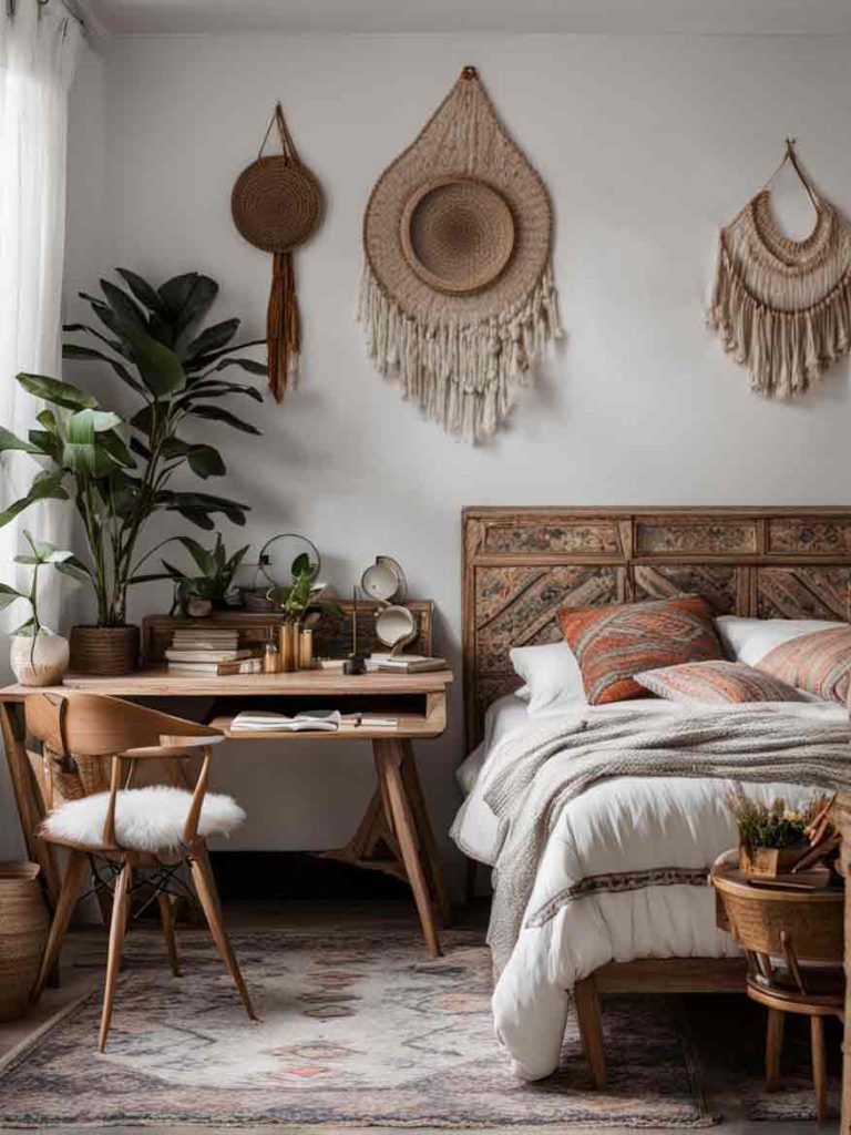
| Brown | Reliable, Down-To-Earth, Dependable | Brown can add a sense of coziness and warmth to a room, making it perfect for living rooms, family rooms and bedrooms. |
What Are Shades And Tints
Shades and tints are simply just variations of a particular color. A shade is created when black is added to it making the color deeper and darker.
Tints are created when white is added to a color making it lighter and brighter. For example, navy blue is a darker shade of blue while pastel blue or baby blue is a lighter tint.
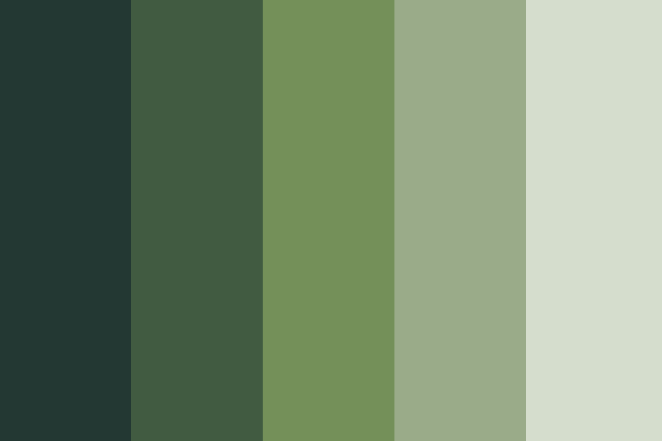
Examples of Color Shades
Here are a couple of examples of different shades of blue ranging from primary blue (#0000FF) all the way to a very dark blue which almost looks black.
| #0000FF | #0000DD | #0000BB | #000088 | #000055 | #000033 |
Examples Of Color Tints
If you are wanting a lighter color palette then tints are the way to go. Using blue again, here are a few examples of different blue tints.
| #0000FF | #4343FF | #7272FD | #9999FF | #BFBFFD | #DFDFFA |
Shades and tints of your main focus color can create a consistent color palette that can add depth and interest to a design while still keeping a cohesive look and feel.

Want bedroom color ideas? Check out our comprehensive article which has over 45 different bedroom color scheme ideas for inspiration!
How to Choose a Color Scheme for Your Home
Choosing a color scheme for your home can feel like a very daunting task but it really doesn’t have to be. With just a few simple steps, you can create a harmonious and peaceful atmosphere in your home.
Here are some tips to help you get started:
Style
Think about the style and personality you want to go for in your home. Do you like a modern, sleek, or minimalistic look? Or do you prefer a more traditional and cozy aesthetic?

Natural Light
Think about the natural light in your home and how it affects the colors you choose, especially for the walls. If your home gets a lot of natural light, you may be able to get away with brighter and bolder colors.
A Rooms Purpose
Think about the purpose of each room and how you want to feel in that space.
For example, you might want to use a calming and relaxing color scheme in your bedroom, while a more energetic or stimulating color scheme might be a good fit for your home office or your kids’ playroom.

Choosing Colors
And now onto choosing actual colors!
Choose A Dominant Color
Your first step is to choose a dominant color that you love! This color would be the foundation of your color scheme and it will help tie together the other colors that you choose.
The dominant color will set the overall tone for your room and it is usually used in the color of the walls, flooring, and even furniture.
If you want to create a peaceful home aesthetic, then using neutral or calming colors as your dominant color is a good idea.
Choose Secondary Colors
Once you have chosen your main dominant color, you can choose secondary colors that complement it.
You can choose colors that are similar in hue (monochromatic colors), or colors that are opposite on the color wheel (complementary colors).
Your secondary colors are usually used in things like your furniture, rugs, and decorations.
Choose an Accent Color
The accent color is a color that will add a pop of color and create visual interest in a room.
Accent colors are usually used in things like throw pillows and artwork. An accent color is usually a bold and vibrant color that adds contrast to a room.

The 60-30-10 Rule
The 60-30-10 rule can be used to create a harmonious color scheme. It works like this:
- 60% Dominant Color
- 30% Secondary Color
- 10% Accent Color
Here’s an example of how this rule could work in practice:
- 60%: Soft gray walls (dominant color)
- 30%: Warm beige furniture and rugs (secondary color)
- 10%: Bright coral throw pillows and vases (accent color)
Remember, the 60-30-10 rule is just a guide and you should adjust it to suit your personal taste and style!
Using Contrasting Colors in Your Home
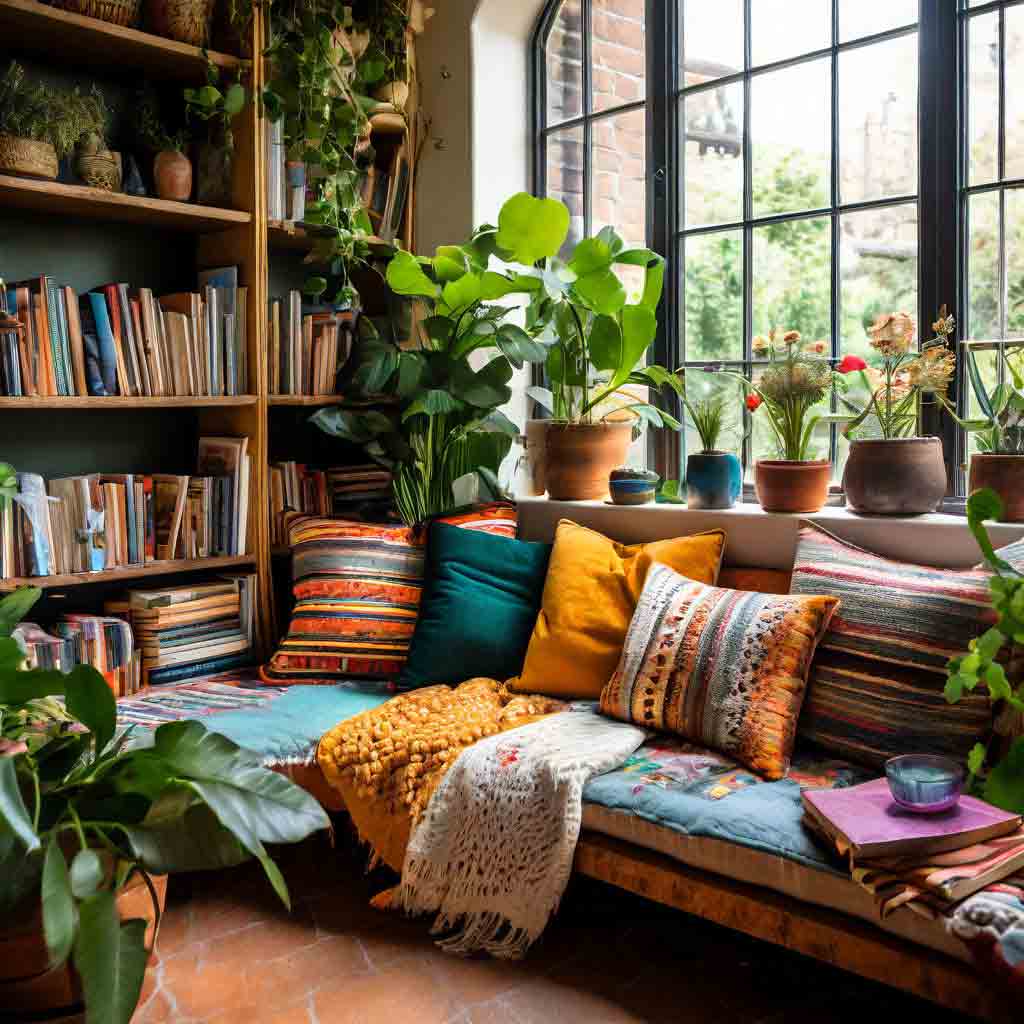
Contrasting colors are generally those that are found opposite each other on the color wheel. But they don’t have to be exactly opposite each other to work well. They simply need to be colors that have a strong visual contrast to each other.
Contrasting colors are great when choosing accent colors for a room because they have a way of grabbing attention and adding visual interest and depth to a room.
Examples of contrasting colors include:
Blue And Orange
Blue and orange are beautiful when used together! And with color palettes ranging from bright and bold to soft and subdued, there are many different moods to choose from.
Check out our collection of blue and orange color palettes here!
| #757FFD | #757FFD |
Red And Green
Green and red are another popular contrasting color choice. By contrasting cool and calm greens with eye-catching shades of red, you can easily draw people’s attention to specific items in a room.
| #A80000 | #5A8139 |
Purple and Yellow
Purple and yellow are more of an unusual complementary color scheme! Most purple colors are associated with luxury while yellow colors are associated with positivity and happiness and using them together can certainly create a dynamic and eye-catching color scheme.
However, when using these colors together it is important to choose the shades and tints wisely so that they are not too garish!
| #6400A6 | #FFF7A1 |
Tip! Be careful when using contrasting colors. Don’t use too many colors and use them sparingly else they can make your room look busy and overwhelming.
Color Palette Examples & Color Guides
An article about color schemes would not be complete without actual examples of different color palettes!
We are slowly putting together collections of color palettes that you can use for inspiration and ideas. Each color palette comes with hex color codes so that you can begin using them right away.
Also don’t forget to check our collection of bedroom color scheme ideas as well as these articles that will help you on your journey to create a peaceful home:
- 11+ Cozy Bedroom Ideas To Help You Create A Peaceful And Relaxing Space
- How To Create A Peaceful Home: 21 Tips To Help You Get Started
- 15+ Meditation Corner Ideas for Small Spaces & Bedrooms
Please also don’t forget to follow Notebook & Penguin on Pinterest for more design and color inspiration!


Final Thoughts
And that’s a wrap! I hope that you’ve enjoyed this article and I hope that it will help you with ideas on how to choose the right color scheme for your home. Have fun with color and thanks for reading!