55+ Happy Shades Of Yellow
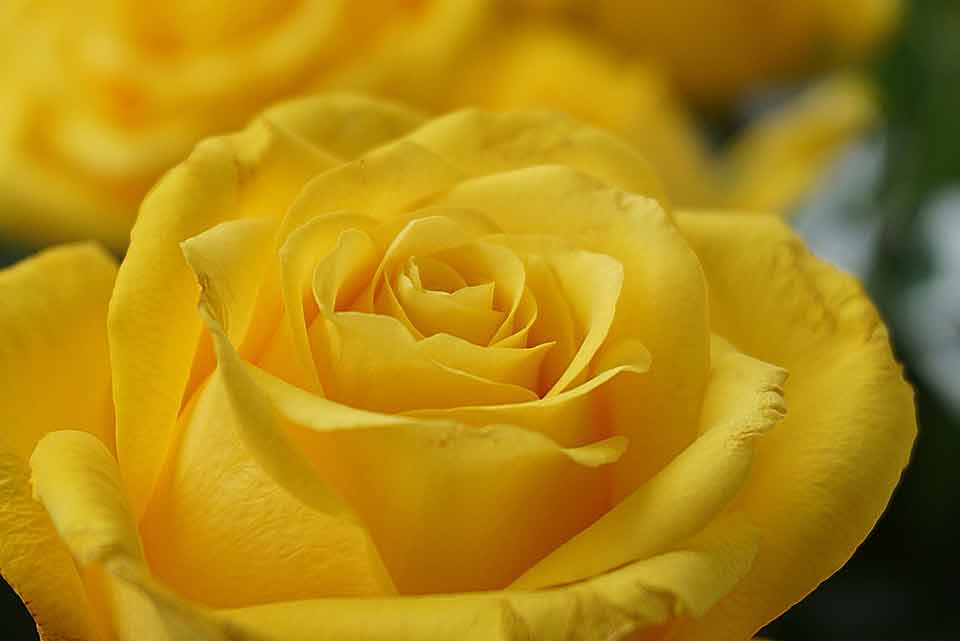
Yellow is a bright warm color that makes us feel happy, optimistic, and positive! There are hundreds of shades of yellow that you can see in nature every day –…

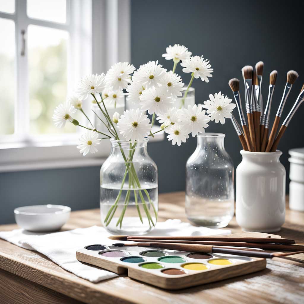
Are you a color lover looking for some fresh ideas to brighten up your journaling practice? Look no further! Our color ideas category is full of inspiration to help you add a pop of color to your journal pages. From colorful pens and markers to beautiful paper and stickers, we’ve got plenty of ideas to get your creative juices flowing. So why not take a look around and see what catches your eye? Your journal (and your inner artist) will thank you!
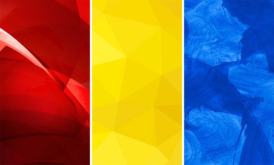
Yellow is a bright warm color that makes us feel happy, optimistic, and positive! There are hundreds of shades of yellow that you can see in nature every day –…
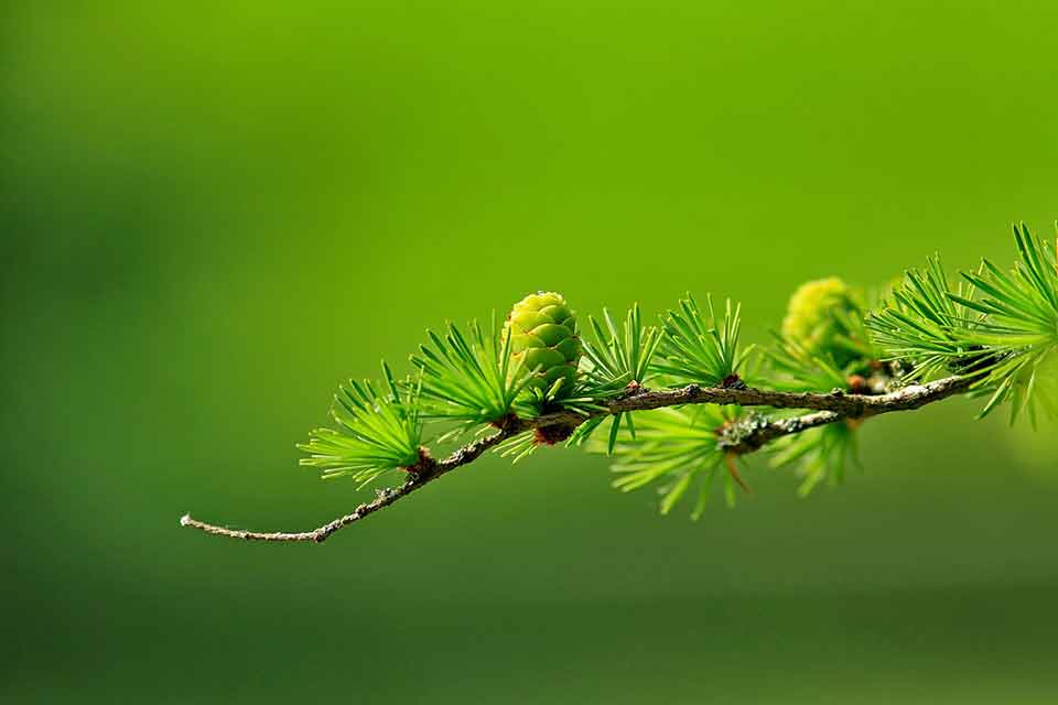
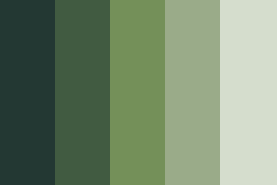
When choosing a color palette it is important to choose colors that resonate with you and you simply can’t go wrong with different shades of green if you want to…
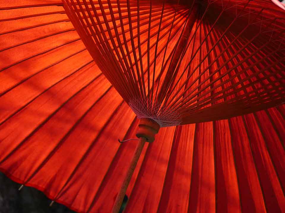
Nobody can deny that red is one of the boldest, brightest colors out there! For centuries red has been linked to fiery emotions such as love and passion and even…
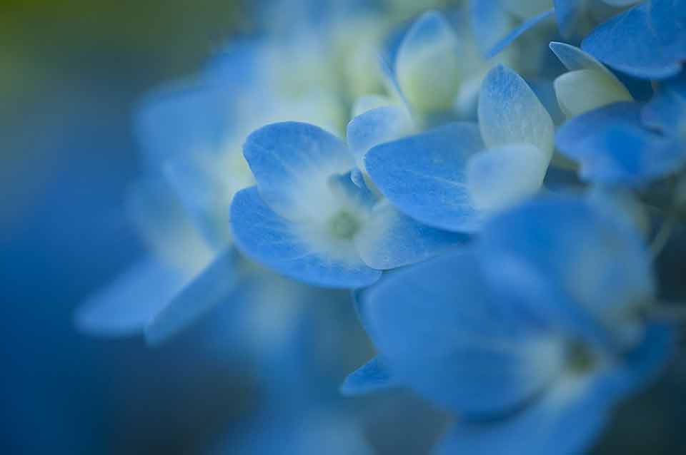
Blue is one of the world’s favorite colors, and it isn’t hard to see why. There are so many different shades of blue to choose from, ranging all the way…

Over the last couple of weeks, I’ve been creating a lot of color palettes that I hope will help you choose the perfect color palette for your designs! As it…
I love color! I find it fascinating how colors and emotions and interlinked and how they can impact our emotions, moods, and behaviors – often subconsciously. For example, did you…
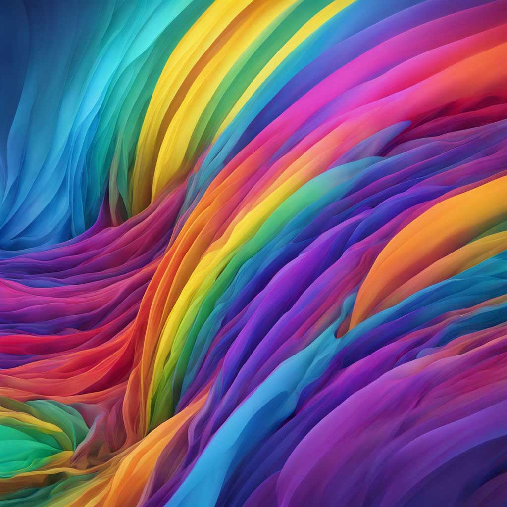
Color Ideas COLOR YOUR WORLD WITH MEANING Color is a powerful tool for expressing emotions and bringing depth to your journaling. From bright hues to muted tones, explore how color…
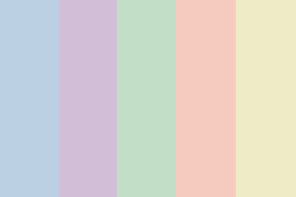
Pastel color palettes have been a favorite for quite a while now, and it’s easy to see why! Their delicate, muted tones are perfect for creating designs that are soft…

When it comes to color, there are the basics: primary colors and secondary colors. Both of these play a fundamental role in color theory and how colors are created. But…

Secondary colors are an essential part of color theory and the color spectrum! In my previous article about primary colors, we briefly touched on how to create secondary colors using…
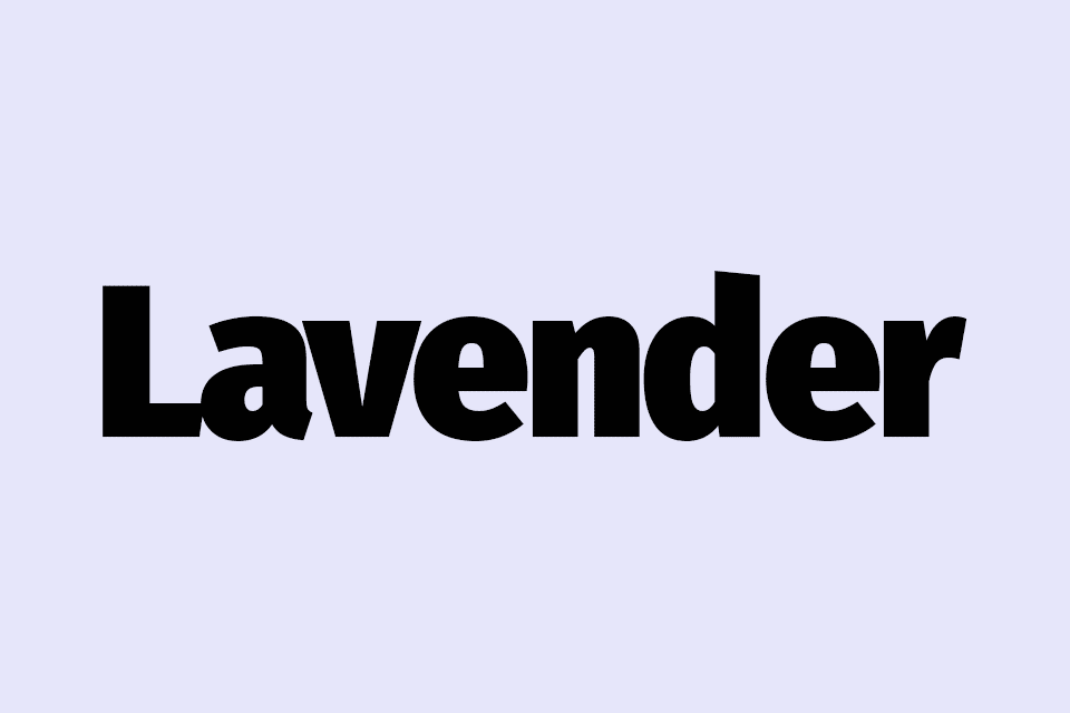
Lavender is a beautiful pale shade of purple or violet that has become increasingly popular in recent years and it is a favorite color choice for many designers. But lavender…
Primary colors are the foundation of all other colors! Or put another way, they are like building blocks on which all other colors that we see and use are created.…
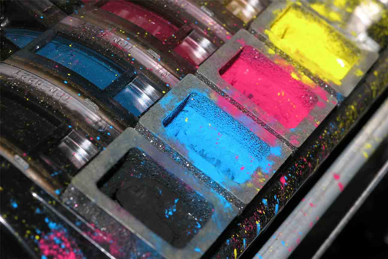
Colors are such an important part of our lives! This is especially true if you are an artist, graphic designer, or in any type of business, printing, advertising, or marketing…

Today we are going to talk about a beautiful color that sits somewhere between blue and violet on the color wheel, the one and only color INDIGO! But what color…
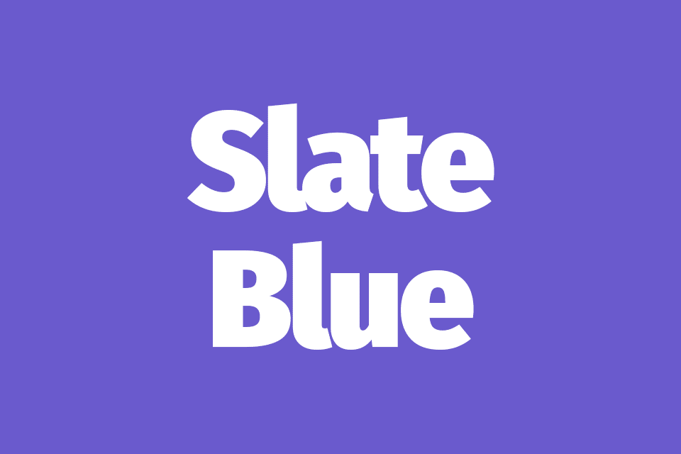
The slate blue color is a gorgeous shade of blue that effortlessly blends tranquility and elegance into one stunningly beautiful color! Picture yourself standing on a misty shoreline in the…
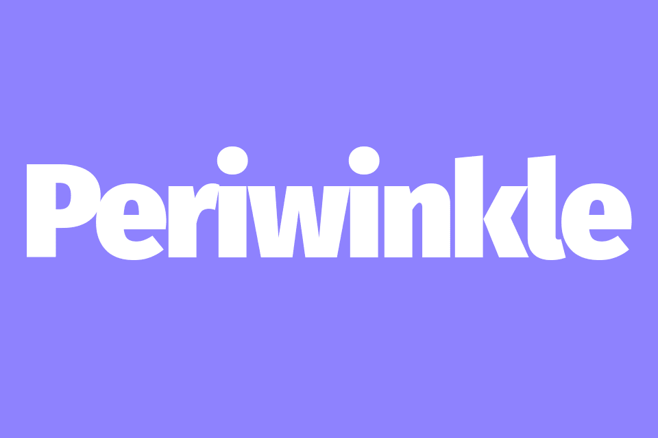
Periwinkle is a mesmerizing color that truly captures the essence of serenity, elegance, and beauty! It is a delicate color that is a blend between blue and purple but unlike…
Violet is a bold color that has an air of sophistication and mystery to it! Not only is it a bright vibrant color but it is also incredibly eye-catching and…
Amethyst is a color that has fascinated and enchanted people for ages! It is a color that is steeped in feelings of mystery, symbolism, and royalty and it has been…

Have you ever come across a color that just screams “Look at me!”? Well, that’s the striking chartreuse color, my friend! Found somewhere between green and yellow it is a…

Russet is a beautiful warm color that reminds me of Autumn leaves and rustic log cabins deep in the woods! I find it to be a nostalgic color that is…

Teal is a beautiful and versatile color that has become quite popular over the last few years with you often seeing it being used in interior design and fashion. Teal…

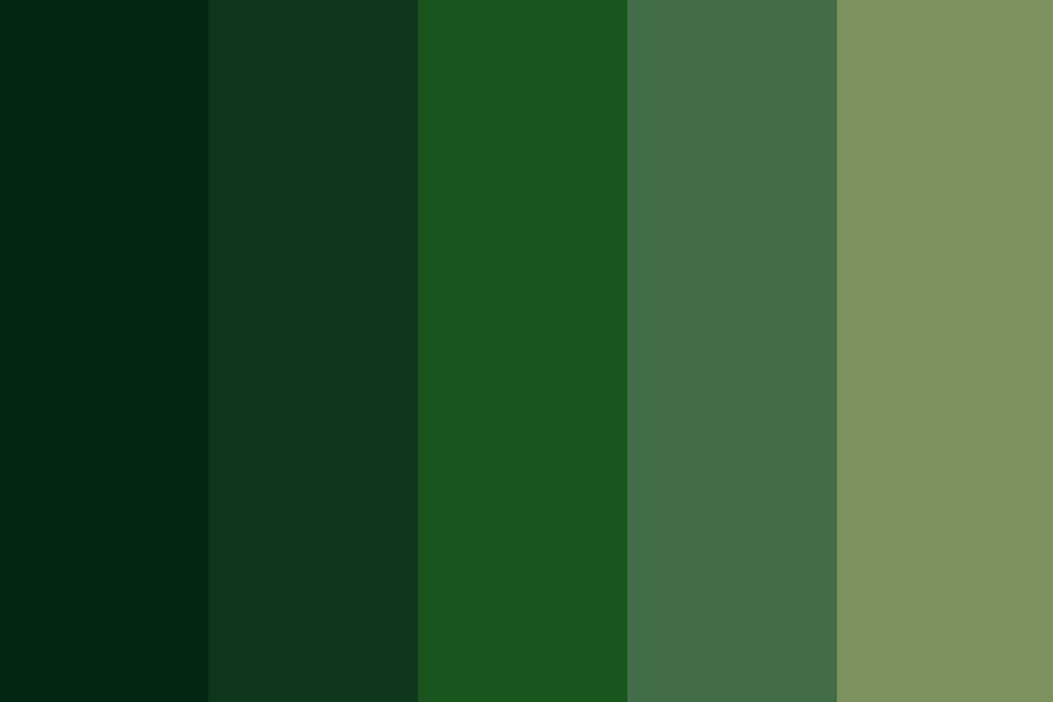
Today we are going to take a look at the enchanting hunter green color! It is a beautiful shade of green that has deep, earthy tones that truly embody the…

Humans are beautiful and diverse creatures! We come in all shapes and sizes and our physical appearance and skin tones are what make each of us truly beautiful and unique!…
Both green and yellow are beautiful colors that people associate with the natural world so they are a great color choice if you want to create a feeling of freshness,…

Orange is a warm, vibrant color that people often associate with energy and happiness, and because many also associate it with autumn, it can also represent transition and change. Orange…

I don’t know about you, but when I think of burgundy,y I think of school uniforms and wine! Not a likely combination, I know! However, don’t be fooled, burgundy is…

Are you looking for a vibrant, eye-catching color to include in your designs? Then look no further than hot pink! This incredibly bold, bright, and playful color is a surefire…

Pink and black are an incredible color combination that is visually striking and attention-grabbing, and there is no doubt that this is a color combo that leaves a lasting impression!…
Pastel pink and other light pink color palettes are soft and delicate and are most often associated with femininity, romance, and innocence. These colors are pretty versatile and can be…

Both green and pink are colors that remind us of nature and growth! When I think of pink and green color palettes, I immediately think of flowers, roses, and watermelons!…

Olive green is a muted, earthy green color with brown and yellow undertones that people tend to associate with nature and health. Of course, olive green gets its name from…
Sage green is one of those colors that has become really popular over the last couple of years and if you are looking for sage green color palette ideas, you…
Green is a color that people associate with nature and growth and dark green seems to add an extra feeling of depth and sophistication when it is used together with…

Blue and purple are both cool colors that can create a beautiful and calming color palette when used together. They work so well together because they appear next to each…

When you use a blue and orange color palette, you create a stunning and eye-catching color combination that certainly won’t go unnoticed! Why do blue and orange work so well…

Blue and yellow are both stunning colors that bring a sense of calm and vibrancy when used together in blue and yellow color palettes. Why is this? When people think…

Today we are going to be looking at some gorgeous blue and gray color palettes and equally beautiful blue-gray color combinations! These subtle, yet striking color combinations offer a unique…